You've uploaded a Short, chosen a frame that looks sharp in the editor, and assumed the thumbnail is ready. Then you open the channel page on your phone and see a cramped face, clipped text, or an image surrounded by awkward empty space. The problem usually isn't your design effort. It's that YouTube Shorts thumbnails use a vertical viewing context, while many creators still design with the older long-form thumbnail habit in mind.
The practical answer is to build around a 1080×1920-pixel canvas in a 9:16 ratio, keep the important content in a central safe area, and test the result where viewers will encounter it. You also need to understand where Shorts thumbnails appear, because the custom frame can matter greatly on channel pages and search while playing a smaller role inside the swipe-based Shorts feed.
The Shorts Thumbnail Trap Most Creators Walk Into
A newer creator named Maya spends several minutes choosing the perfect moment from a talking-head Short. Her face is clear, the background is bright, and the headline sits neatly across the lower part of the frame. In the desktop upload view, everything looks balanced.
After publishing, Maya checks the Short from her phone. The headline is partly hidden, her face feels too close to the edge, and the image looks less like a deliberate thumbnail than a random video still. She hasn't made a bad thumbnail. She's applied long-form design assumptions to a vertical surface.
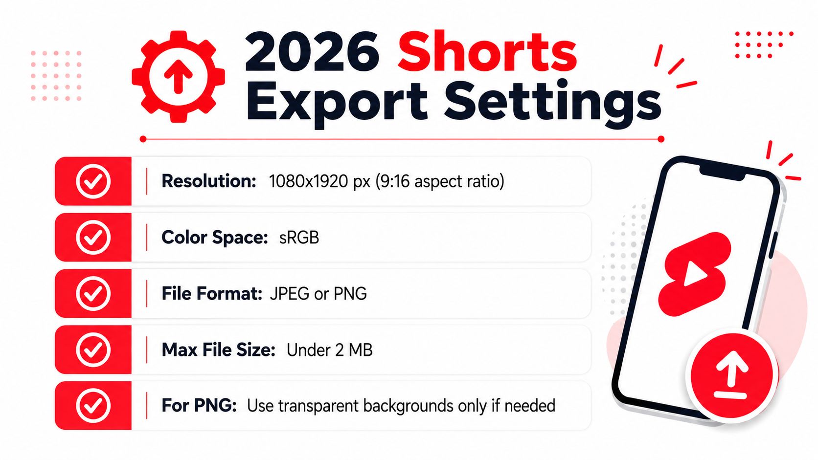
YouTube's general thumbnail convention is built around 1280×720 pixels and a 16:9 aspect ratio, a format that gives designers a broad horizontal canvas. YouTube Shorts thumbnail guidance increasingly points creators toward 1080×1920 pixels in a 9:16 frame, with the file kept under 2 MB and exported as JPG, PNG, GIF, or BMP. The difference isn't cosmetic. A wide composition gives you room to place a subject on one side and text on the other, while a tall frame makes vertical stacking and central placement more practical.
Why the feed changes the design problem
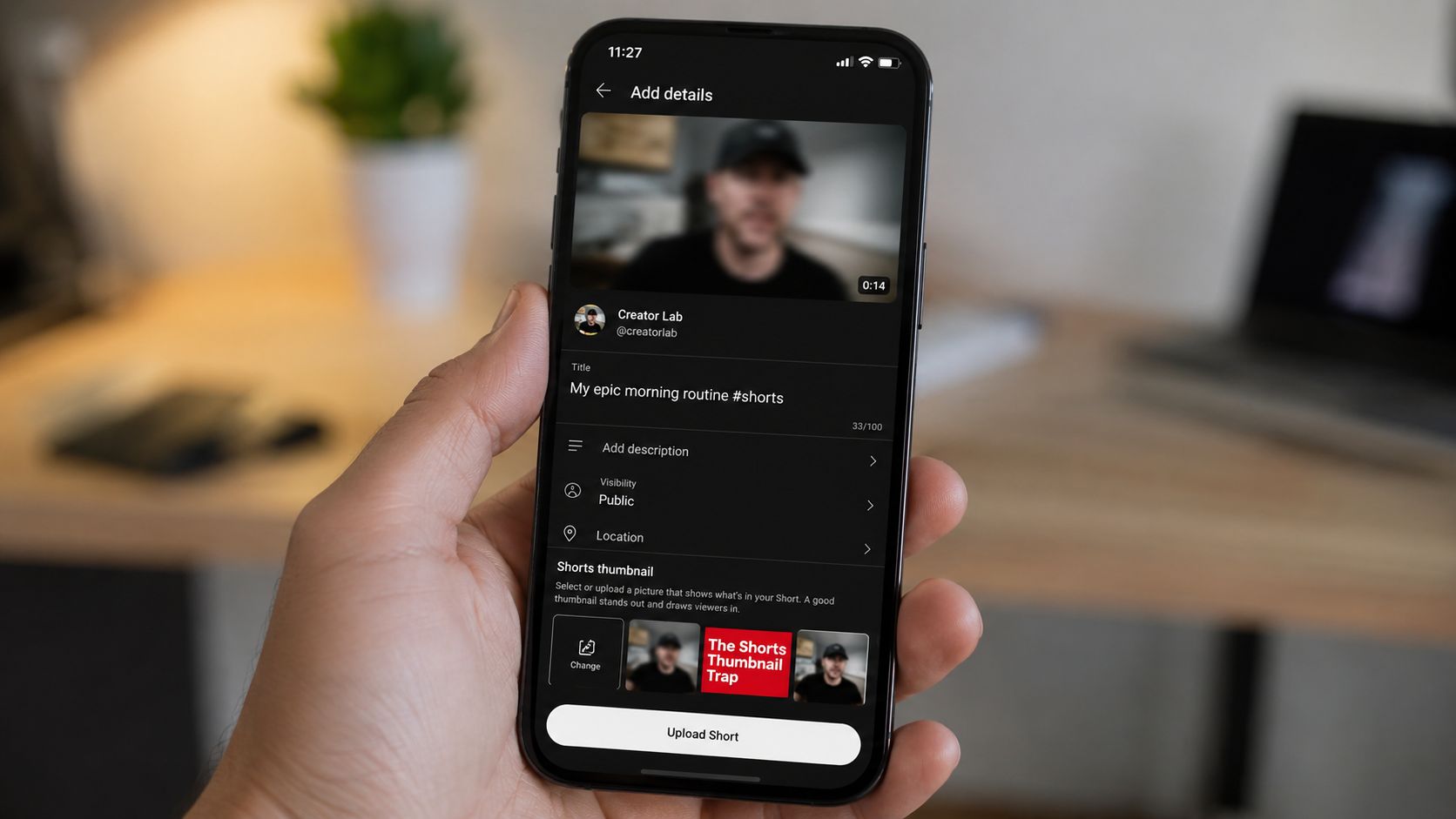
A Shorts thumbnail has to survive small-screen viewing, rapid swiping, mobile compression, and different crops across YouTube surfaces. Text that looks bold on a desktop monitor can become a thin blur on a phone. A face placed comfortably near the side of a horizontal frame may be pushed out of view when the asset is displayed vertically.
The product history helps explain the confusion. YouTube launched Shorts in India on September 15, 2020, followed by a worldwide rollout on July 12, 2021, turning short-form, mobile-first viewing into a major publishing surface. YouTube's vertical Shorts overview describes the format as designed around a vertical mobile experience, which means thumbnail decisions now have to account for a feed rather than only a desktop browse page.
Practical rule: Design the thumbnail as if someone will see it on a small phone, at a glance, with no time to decode a busy composition.
Maya fixes her frame by moving the face toward the center, replacing the sentence-length headline with a short phrase, and removing decorative elements that don't explain the payoff. The result feels simpler, but it communicates faster. That's the central shift: Shorts thumbnails reward immediate recognition more than elaborate layout.
Exact Specs Every Shorts Thumbnail Needs
Start with a vertical document sized at 1080×1920 pixels. That gives you a 9:16 aspect ratio, matching the portrait frame associated with Shorts and giving the artwork enough resolution for mobile display. The recommendation is supported by creator-education guidance that converges on this production standard, although YouTube thumbnail documentation can still appear inconsistent because the general thumbnail system uses a different format.
Use a file under 2 MB. Export as JPG, PNG, GIF, or BMP, based on the guidance summarized in this YouTube thumbnail size reference. PNG is useful when the design contains crisp typography, flat shapes, or transparency. JPG can produce a smaller file for photographic artwork, but compression can soften fine text and facial detail.
Why the older specification still appears
Many creators encounter 1280×720 pixels at 16:9 in general YouTube thumbnail resources. That remains the long-form standard and is the reason older guides often repeat it when discussing Shorts. The vertical Shorts experience is separate, so the safest workflow is to create a dedicated 9:16 asset rather than forcing a wide thumbnail into a tall container.
Some resources also mention minimum-width guidance, including 640 pixels, while older general-thumbnail references may present other minimum-width rules. Those figures belong to broader thumbnail documentation, not a reason to shrink a Shorts design. Building at 1080×1920 gives you a clear working canvas and makes it easier to inspect text, faces, and contrast before export.
For screen graphics, use sRGB so colors remain predictable across common mobile displays. DPI matters far less than pixel dimensions for a digital thumbnail, but an export setting between 72 and 96 DPI is a practical screen-oriented preset in tools such as Photoshop, Canva, and Figma. The file's actual width and height are what determine the display canvas.
Quick reference
| Requirement | Shorts thumbnail guidance |
|---|---|
| Resolution | 1080×1920 pixels |
| Aspect ratio | 9:16 vertical |
| File formats | JPG, PNG, GIF, or BMP |
| File size | Under 2 MB |
| Color space | sRGB recommended |
| Layout priority | Keep faces, text, and key cues central |
Before uploading, open the exported file on your phone. If you need to pinch and zoom to read the headline, the viewer probably won't read it while scrolling. A thumbnail is finished when the message remains clear at the size your audience encounters, not when it looks impressive at full resolution.
Shorts Thumbnails Versus Long-Form YouTube Thumbnails
The easiest way to understand the difference is to compare the canvases. A long-form thumbnail uses 1280×720 pixels in a 16:9 ratio, while a Shorts thumbnail is commonly produced at 1080×1920 pixels in a 9:16 ratio. One is a wide billboard. The other is a tall poster held close to the viewer.
On a horizontal thumbnail, a designer can place a person on the left, a product or result on the right, and a headline across an open section of background. The width supports side-by-side comparisons, broad scenes, and layered supporting details. A vertical Short gives you much less horizontal room, so the same arrangement often creates tiny text and competing focal points.
A better vertical layout usually stacks the idea. Put the face or main object near the middle, place a short headline above or below it, and use one visual cue to explain the payoff. Logos and secondary imagery should stay restrained because they consume space quickly in a tall frame.
What changes when you switch formats
Cropping is the first failure point. If you take a 16:9 thumbnail and crop it into 9:16, the edges disappear. That can remove a person's face, cut off a before-and-after result, or leave a headline without the word that gives it meaning. Rebuilding the composition on a vertical canvas is more reliable than relying on an automatic crop.
Text placement also changes. Long-form designs can tolerate a longer phrase because the viewer has more horizontal space. Shorts designs need fewer words, larger letterforms, stronger contrast, and enough breathing room around the subject. Keep the most important visual information near the center so it can survive different display treatments.
| Element | Shorts Thumbnail | Long-Form Thumbnail |
|---|---|---|
| Canvas | 1080×1920 pixels | 1280×720 pixels |
| Ratio | 9:16 vertical | 16:9 horizontal |
| Layout | Stacked, centered, vertically paced | Side-by-side, wide, layered |
| Text strategy | Short phrase with large type | More room for a longer headline |
| Subject placement | Central or upper-central focal point | Left, right, or centered |
| Main risk | Clipping from overlays and narrow crops | Excess empty space or weak mobile scaling |
A useful production system keeps separate templates for each format. Don't ask a long-form thumbnail to do the job of a Shorts thumbnail by squeezing it into a new ratio. Create the Shorts version from the same visual idea, but redesign the hierarchy for the tall frame.
Where Your Shorts Thumbnail Actually Shows Up
Creators often judge a Shorts thumbnail by looking only at the fullscreen player. That's misleading because the thumbnail's visibility changes across YouTube. In the swipe-based Shorts feed, viewers primarily encounter the playing Short, so the selected frame may have less influence on the initial viewing experience than it does elsewhere.
The custom artwork matters more when people browse your channel's Shorts tab, encounter the video in search, or see it in another surface that presents a preview before playback. On a channel page, a vertical image can act like a small poster for the video. Consistent faces, colors, and text treatment can help viewers recognize your content as they scan the grid.
Desktop introduces another complication. A vertical asset may appear with side padding or letterboxing inside a wider page layout. That doesn't mean the 9:16 design is wrong. It means the same visual has to remain understandable when the surrounding interface gives it more horizontal space than the original canvas used.
A surface-by-surface audit
| Surface | Thumbnail shown? | Aspect behavior | Designer implication |
|---|---|---|---|
| Mobile Shorts feed | Often limited as a static preview | Vertical player dominates | Make the video's opening frame visually coherent |
| Channel Shorts tab | Commonly visible | Tall card or vertical crop | Keep the face and headline central |
| Mobile watch context | May appear during browsing | Vertical presentation | Design for quick recognition |
| Search results | Can appear as a preview | May be cropped or padded | Avoid edge-dependent meaning |
| Subscriptions feed | Presentation can vary | Mixed interface treatment | Keep the central message intact |
| Desktop channel shelf | Often visible with more surrounding space | Side padding or letterboxing possible | Use a strong central composition |
The YouTube thumbnail preview guide is useful for thinking about how one thumbnail can be interpreted in more than one display context. The practical lesson is to test the artwork in the mobile app, on the channel page, and in a desktop browser rather than approving it from one editor window.
Attribution links add another layer. If your Short points viewers toward a product, service, or lead form, use a trackable destination link and consistent naming for the video and campaign. That lets you compare whether a thumbnail-led visit from a channel page produces meaningful action, rather than treating every view as equal.
A thumbnail can attract attention, but only a tracked path can show whether that attention led anywhere valuable.
Export Settings and Design Rules That Hold Up
Create one reusable export preset and apply it consistently. Set the document to 1080×1920 pixels, choose 9:16, use sRGB, and export as PNG or JPG under 2 MB. PNG is a sensible default for sharp text and graphic shapes, while JPG can work well for image-heavy designs when the compression remains clean.
You can build the file in Photoshop, Canva, or Figma. A screen-oriented export around 72 to 150 DPI is practical, but don't confuse DPI with the thumbnail's actual resolution. The pixel dimensions control the canvas. After exporting, view the file on a phone that approximates the experience of your audience and check it at normal viewing size.
Build a safe composition
A practical working zone is the central 1080×1512-pixel area. Keep the face, headline, and main object inside that region, and treat the bottom 250 pixels as a risk area because interface elements can compete with content there. These working guides are design safeguards rather than guarantees about every YouTube surface, so leave visual breathing room instead of placing important words against an exact boundary.
Use one obvious focal point. A close-up face, a product, a transformation result, or a highlighted interface element should tell the viewer what the Short is about before the text is fully read. If the viewer has to inspect a collage, the design is carrying too much information.
Rules for mobile readability
- Use strong contrast: Light type on a dark shape or dark type on a light field survives compression better than delicate color combinations.
- Keep the headline brief: A few meaningful words are easier to process than a sentence squeezed into a narrow frame.
- Separate type from the background: Add a solid text panel, outline, shadow, or controlled gradient when the image behind the lettering is busy.
- Place faces deliberately: Leave room around the eyes and mouth, and don't let the frame cut through the most expressive part of the face.
- Limit brand colors: One primary accent and a supporting neutral usually create a clearer hierarchy than a full palette.
- Treat emojis as accents: One recognizable symbol can reinforce an idea, but several can make the thumbnail look noisy.
Skip aggressive sharpening filters. They can create halos around text and facial features after YouTube applies additional processing. Export, inspect, and then compress only as much as necessary to meet the file limit.
A strong preset prevents technical rejection, but it doesn't guarantee a useful thumbnail. The final check is human: shrink the design until it resembles a phone preview and ask someone to identify the topic without additional context.
Thumbnail Styles That Win in the Shorts Feed
The strongest Shorts thumbnail styles usually communicate one promise quickly. A tight talking-head close-up can work when the expression carries emotion and the text adds a short hook. A before-and-after frame can work when the two states are visually distinct and the viewer understands what changed without studying tiny details.
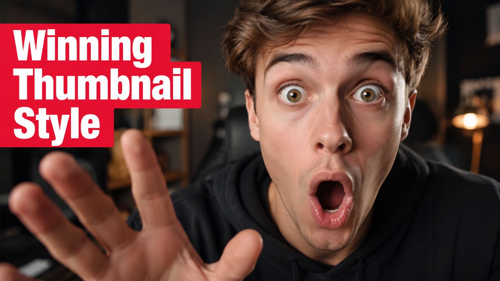
The shocked expression in this example occupies meaningful visual space, while the red text gives the emotion a direction. That combination is more immediate than a small subject surrounded by decorative elements. For a tutorial, replace the emotional cue with a visible result, a bold action word, or a circled interface control that makes the promised lesson obvious.
Four useful creative patterns
Talking-head hook: Use a close crop, a clear facial expression, and a short phrase. This suits reactions, opinions, warnings, and quick explanations.
Transformation frame: Divide the composition into before and after states, or use a visible progression. Keep each side simple enough to recognize on a small screen.
Tutorial signal: Show the outcome or the important control, then add an arrow or circle. The annotation should guide the eye, not become the subject.
List preview: Stack a small number of readable cues, such as short labels or compact bullets. Don't turn the thumbnail into a miniature article.
Collages often struggle because every image competes for attention. Dark product photography can also lose definition when the subject blends into the background or compression removes subtle detail. If a darker visual is essential, add a controlled light edge, brighter highlight, or contrasting text panel.
Here's a short visual reference for how a thumbnail concept can support a Short's broader presentation:
A creator rebuilding a weak thumbnail might start with a crowded frame showing a room, several props, and a long headline. The redesign removes the props, enlarges the creator's face, and uses one phrase that names the outcome. The video itself hasn't changed, but the thumbnail now gives the viewer a clear reason to identify the subject and investigate the Short.
For production ideas that connect the visual hook with the broader publishing workflow, optimize YouTube Shorts for property offers a relevant planning perspective. Use the same principle across niches: make the subject obvious, make the payoff visible, and remove anything that doesn't help the viewer decide.
Uploading and Adjusting Your Shorts Thumbnail
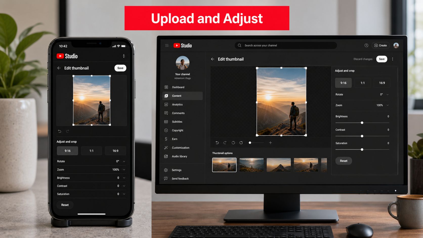
The editing path can vary by account, app version, and YouTube's current interface, so treat the labels below as a practical route rather than a permanent guarantee. On mobile, open the YouTube or YouTube Studio workflow associated with the Short, locate the video details, and look for the pencil or edit icon beside the thumbnail preview. Select the frame or uploaded artwork available in your workflow, save the change, and then inspect the result from the mobile app.
On desktop, open YouTube Studio, go to Content, select the Short, and open its details panel. If your account and current Studio interface provide a replacement control, use Replace thumbnail, upload the prepared file, save, and wait for the interface to confirm the update.
Troubleshoot the common blockers
- File rejected: Check that the export is under 2 MB and uses a supported format such as JPG, PNG, GIF, or BMP.
- Artwork looks cropped: Reopen the file at 9:16 and move the face and headline toward the central safe area.
- Change doesn't appear immediately: Refresh Studio and the mobile channel view before exporting a new version.
- Permission is missing: Confirm that the signed-in account has permission to edit the channel or Brand Account content.
- Mobile and desktop disagree: Verify the Short in the mobile app, where viewers are more likely to encounter its vertical presentation.
You can also use how AI Image Detector helps verify thumbnails as part of an asset-checking workflow when you need to review an image before publishing. The important verification step is visual, not theoretical. Reopen the Short on a phone, visit the channel's Shorts tab, and confirm that the new frame still communicates the topic without clipped text or a misplaced face.
Save a copy of the final asset using a clear filename that identifies the Short, version, and concept. That small habit makes later comparisons easier and prevents you from confusing an older design with the one currently attached to the video.
Turning Thumbnail Tests Into Real Revenue Signals
A thumbnail test becomes more useful when you connect it to what happens after the view. Shorts can generate views, watch time, profile visits, and clicks, but those signals answer different questions. A view suggests exposure, while a tracked link click shows that someone took an action beyond passive consumption.
Use consistent naming for each Short and attach a trackable destination link to the relevant offer. A UTM-tagged link in the description or profile path can help separate traffic from different videos and surfaces. ViewsMax provides a workflow for creating trackable links and connecting content activity with clicks, leads, and sales, which fits a creator who wants to evaluate revenue rather than only reach.
Use a clean test loop
Change one meaningful element at a time. You might compare a close face crop with a wider crop, test a red text panel against a neutral one, or replace a descriptive image with a visible outcome. Keep the subject, topic, publishing process, and destination consistent enough that the thumbnail remains the clearest variable.
Run the same creative question across at least five uploads, then compare the results side by side. This guide to making money on YouTube Shorts provides useful context for treating Shorts as part of a broader monetization system, rather than isolating thumbnail performance from the business path.
Measurement principle: Don't call a thumbnail successful because it earned attention. Ask whether the right viewers continued, visited, clicked, subscribed, or bought.
Shorts require a slightly different reading of the data because the thumbnail may appear outside the active vertical feed, while the video itself can autoplay inside the feed. That means thumbnail performance and opening-frame performance aren't interchangeable. Track both, and avoid assuming that a strong view count proves the custom image caused the result.
A six-point review checklist
- Name the variable: Record whether you changed the crop, headline, color, or focal image.
- Keep the promise aligned: Make sure the thumbnail describes what the Short delivers.
- Use one destination: Send comparable videos to the same relevant offer when testing conversion.
- Tag the link: Apply consistent tracking parameters so clicks can be assigned to the right Short.
- Compare downstream actions: Review profile visits, clicks, leads, and sales alongside viewing data.
- Keep the winner in context: A design that works for tutorials may not suit reactions, reviews, or transformations.
Thumbnail testing is most valuable when it changes your next production decision. Keep the visual variable clear, preserve the attribution path, and let revenue evidence influence which style you repeat.
ViewsMax helps creators connect content with measurable outcomes by creating trackable links, organizing publishing workflows, and showing clicks, leads, and attributed sales alongside the content that generated them. Visit ViewsMax to connect your Shorts thumbnail experiments with the revenue signals that matter.