You open Instagram Insights and see a healthy spike. Reach is up, profile visits look promising, and the engagement rate gives you a satisfying green arrow. Then you open your store, email platform, or CRM and face the question the native dashboard can't answer: which post created the sale?
A social media analytics dashboard should close that gap. It isn't merely a screen for collecting likes, impressions, and follower counts. Properly designed, it connects platform activity with funnel movement, attribution, and revenue, while preserving each network's definitions and counting rules. The result is a decision system that tells you what to repeat, revise, stop, or fund.
The Dashboard Problem Every Creator Eventually Faces
Maya has just reached 50,000 followers after a Reels post spreads far beyond her usual audience. Instagram reports 180,000 reach, 12,000 profile visits, and a 6.8% engagement rate. She feels confident that the post has changed her business.
Shopify tells a less dramatic story. There are three orders totaling $214, but none is connected clearly to the Reel. Maya can see that something happened, yet she can't tell whether the purchase came from the video, an older email, a returning customer, or a separate product page. The platform rewarded visibility, while her business needed evidence of influence.
This disconnect usually appears through familiar symptoms:
- Spikes never recur. A post gets broad distribution, but the team can't identify the hook, audience, or offer responsible for the result.
- Audience growth doesn't translate. Follower numbers rise while email sign-ups, booked calls, or product-page visits remain difficult to explain.
- The content calendar follows applause. The team repeats formats that earn comments or likes, even when other content moves prospects toward a commercial action.
A centralized dashboard can combine metrics from multiple platforms, but aggregation alone won't solve Maya's problem. A cross-platform total can be misleading because each network applies its own counting rules. As one social media analytics guide warns, adding views across platforms doesn't produce a meaningful single view count.
Practical rule: A metric earns a place on your dashboard only when it supports a decision.
The useful shift is from counting impressions to measuring decisions. That means assigning content to a funnel stage, connecting links and events to downstream actions, and checking whether dashboard totals remain close enough to source data to trust. The framework below treats revenue attribution, funnel-stage contribution, and a 5% variance tolerance as operating requirements, not decorative extras.
What a Social Media Analytics Dashboard Actually Does
A reporting screen answers, “What happened?” A decision system answers, “What should we do next, and what evidence supports that choice?” A social media analytics dashboard becomes useful when it makes the second question easier to answer.
At its simplest, the dashboard creates a centralized view of metrics drawn from different networks. That can include reach, impressions, engagement, follower growth, clicks, watch time, and mentions. The value isn't that every number appears together. The value is that the team can compare related activity without repeatedly logging into each platform, while still respecting platform-specific definitions.
A practical dashboard performs four jobs:
- It tracks awareness. Reach and impressions show how widely content was distributed, but they shouldn't be treated as interchangeable.
- It measures engagement quality. Saves, shares, meaningful comments, profile visits, and clicks reveal more about intent than a loose pile of reactions.
- It maps funnel progression. The dashboard connects content exposure to site sessions, sign-ups, downloads, leads, or other defined actions.
- It assigns commercial credit. UTM parameters, pixels, analytics platforms, and CRM records help connect posts or campaigns with conversions and revenue.
The contrast is easiest to see in two dashboard designs. A vanity view stacks likes, follower count, and impressions in isolated cards. A funnel-aware view places impressions at the top, intent signals such as saves and click-through rate in the middle, and assisted conversions or revenue at the bottom.
Every card should lead to an action: cut, double down, iterate, or escalate to paid. A useful guide to analytics dashboards for writers is helpful for creators who want to translate performance data into clearer content decisions rather than just produce another report.
Keep the architecture simple. Start with core KPIs, add the attribution plumbing that gives those KPIs business meaning, then use a rollout checklist to validate definitions, ownership, and source consistency.
The Core KPIs and What Their Formulas Really Measure
A dashboard becomes credible when every KPI has a definition, formula, and limitation. The HubSpot reference on social media metrics describes the core logic behind measures such as reach, impressions, engagement rate, click-through rate, follower growth, and conversion rate.
Visibility metrics
Reach measures unique people or accounts exposed to content. Impressions measure the total number of displays, including repeat exposure. Reach answers “how many distinct accounts did we reach?” Impressions answer “how often was content displayed?”
Neither metric proves attention or business value. A person can be counted as reached without remembering the message, and impressions can include repeated displays that don't create new demand. Never add views or reach across platforms as though the totals represent unique people. The counting rules differ by network.
Interaction and intent metrics
Engagement rate is commonly calculated as:
total engagements ÷ reach × 100
It estimates the proportion of reached accounts that interacted. The hidden assumption is that all engagements carry comparable meaning. A like, save, share, and substantive comment don't necessarily indicate the same level of intent.
Click-through rate is:
link clicks ÷ impressions
It connects exposure with a click action, but only if impressions and clicks use compatible scopes and time periods. Save rate and share rate often provide stronger signals of usefulness or advocacy than likes, although each still needs a defined denominator.
Video completion rate and average watch time describe how much video people consume. These measures can help diagnose whether the opening earns attention, but platform definitions vary, particularly around what qualifies as a view or completion. Don't compare them without recording each platform's rule.
Commercial metrics
Conversion rate measures the proportion of clicks that become a defined action, such as a sign-up, download, lead, or purchase:
conversions ÷ link clicks
The formula assumes the click and conversion events are tracked consistently and that the attribution window is appropriate.
Revenue per mille is:
revenue ÷ impressions × 1,000
It translates revenue into an impression-based efficiency measure. It isn't normally visible in native social analytics because revenue usually lives in a store, payment system, analytics property, or CRM.
| KPI | Formula | Measures | Hidden trap |
|---|---|---|---|
| Reach | Unique exposed accounts | Distribution breadth | Doesn't prove attention or deduplicate across platforms |
| Impressions | Total content displays | Exposure volume | Can include repeat displays |
| Engagement rate | Engagements ÷ reach × 100 | Interaction relative to exposure | Treats different interactions as equivalent |
| Click-through rate | Link clicks ÷ impressions | Movement from exposure to click | Depends on compatible scopes and periods |
| Watch time | Platform-defined viewing duration | Depth of video consumption | Definitions differ by network |
| Conversion rate | Conversions ÷ link clicks | Clicks becoming defined actions | Fails when events or attribution are incomplete |
| Revenue per mille | Revenue ÷ impressions × 1,000 | Revenue efficiency against exposure | Requires external revenue and trustworthy impression data |
For a practical contrast between platform-specific engagement calculations, see this YouTube engagement rate calculator. The important lesson is simple: a formula doesn't remove context. It makes the context explicit.
Native Analytics Versus Third-Party Aggregators
Native analytics and third-party dashboards solve different problems. Native tools are closest to the platform's own records, so they're usually the right place to diagnose why a particular post, audience, or video behaved as it did. Aggregators provide the unified view needed for cross-channel reporting, but they introduce a normalization layer that must be inspected.
Meta, LinkedIn, X, TikTok, and YouTube expose platform-specific information about impressions, engagement, audience behavior, and video retention. Those definitions don't line up automatically. Reach, views, completion, and engagement can follow different eligibility rules, so a native result may be accurate within its own environment while remaining unsuitable for direct comparison with another network.
Third-party tools such as Sprout Social, Hootsuite, and Looker Studio can pull data through APIs and organize it in one place. That saves reporting effort and makes trends easier to scan, but it doesn't guarantee perfect comparability. API sampling, delayed synchronization, timezone differences, and platform changes can affect the numbers. A dashboard also shouldn't assume that a person active on Instagram and Facebook represents two separate people when the business question concerns audience size.
| Dimension | Native Analytics | Third-Party Aggregator |
|---|---|---|
| Primary use | Diagnose one platform | Review cross-channel trends |
| Definitions | Native to the network | Mapped or normalized |
| Detail | Strong post and audience detail | Strong portfolio and campaign view |
| Main risk | Siloed reporting | Sampling, sync, and mapping errors |
| Best decision | Improve a primary channel | Compare channels and summarize performance |
Creators working heavily on LinkedIn may benefit from reviewing a practical selection of LinkedIn analytics tools, especially when native reporting needs to sit beside broader campaign data. For video-focused teams, YouTube growth tools can complement native YouTube diagnosis without pretending that every platform metric means the same thing.
Use a clear decision rule. Keep native analytics as the diagnostic authority for the primary channel. Use a third-party aggregator for executive trends, campaign comparisons, and operational visibility. Before reporting, write down the definition each tool uses.
Building the Attribution Layer Behind the Dashboard
A creator can see traffic in a dashboard and still miss the post that caused it. The missing layer is attribution, which connects a content action to a site event, customer record, and eventually revenue.
Standardize the link
Create one naming convention for every outbound link. Use values such as utm_source=instagram, utm_source=linkedin, or utm_source=tiktok; set utm_medium to social-organic or social-paid; and assign utm_campaign to a content pillar, launch, or offer window.
Consistency matters more than the exact labels. “IG,” “Instagram,” and a blank source become separate reporting values even when they describe the same channel. Bitly or Pretty Links can shorten URLs and carry click identifiers, as long as the redirect preserves the UTM parameters.

Capture the event
Set up the measurement layer for each platform and property involved. Depending on the setup, that may include Meta Pixel, LinkedIn Insight Tag, TikTok Pixel, or server-side Google Tag Manager. Privacy restrictions can weaken browser-only tracking, so document which events are observed directly and which rely on modeled or server-side signals.
The dashboard should make this path visible:
post or video → tagged click → site session → defined event → CRM record or order
For creators optimizing their YouTube workflow, TubeBuddy for YouTube can help manage tags and track performance alongside the attribution setup.
Preserve the source in the CRM
When someone submits a form, HubSpot or Salesforce should capture the UTM values and retain first-touch and last-touch fields on the contact record. Those fields support a multi-touch model, so the team can recognize earlier contributions instead of assigning every conversion to the final click.
The content marketing dashboard guidance from Improvado recommends UTM-tracked clicks, weekly validation against source platforms, and explicit data lineage. It also identifies timezone mismatches, bot filtering, GA4 sampling, and CRM sync delays as common causes of disagreement, with under 5% variance between dashboard and source totals suggested for core metrics such as sessions, conversions, and revenue.
Define attribution windows as well. Use a short click-through window for low-consideration captures and a longer engagement window for higher-value purchases, then document those rules rather than treating them as universal. Review tags and event flows weekly. A broken redirect discovered after a campaign can invalidate the conclusions drawn from the dashboard.
Mapping Content to Conversions Across the Funnel
A post can contribute to revenue without closing the sale immediately. The dashboard should therefore show progression, not just the final transaction.
At the awareness stage, review impressions, reach, and early attention signals against the platform's own baseline. The question is whether the creative earns distribution and initial attention with the intended audience. A broad impression count without audience relevance doesn't establish demand.
At consideration, examine saves, shares, comment quality, profile visits, and link-out CTR. Pair those signals with events such as email opt-ins, gated downloads, or add-to-cart actions. A post that earns fewer visible reactions but generates qualified site activity may deserve more attention than a highly shared post that produces no downstream movement.
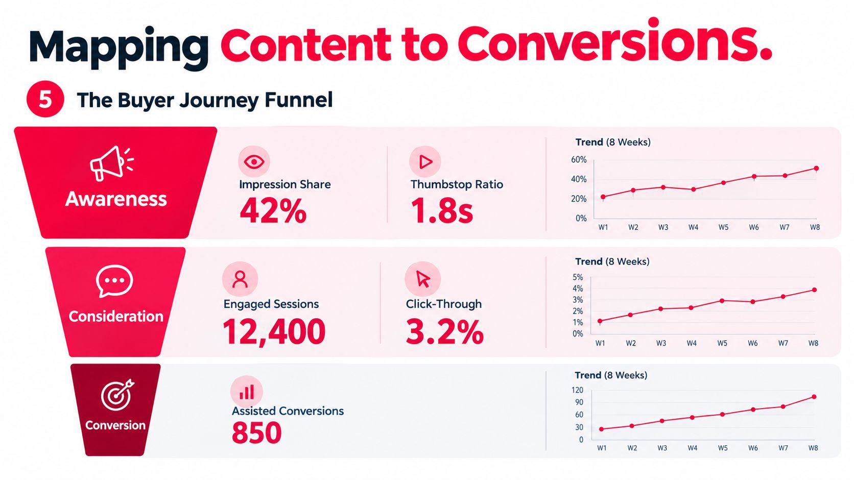
At the decision stage, connect assisted conversions, branded search behavior, time to purchase, and closed revenue. Social content may introduce the offer while another channel receives the final click. That doesn't make the original content irrelevant, but the dashboard should label it as an assist rather than claiming last-click credit.
Each stage needs its own audience definition, event or UTM variant, and acceptable latency. Keep those definitions visible beside the widget so a viewer knows what the number represents.
Buying journeys are often asynchronous. Someone may watch a TikTok video, search the brand later, and purchase through a direct visit. A short reporting window can make the video look ineffective. Review longer lookback windows, such as 30, 60, and 90 days, when the offer involves meaningful consideration, and compare the results with a shorter window for immediate-response campaigns.
Why Fewer KPIs Beat More in a Real Dashboard
A crowded dashboard can hide poor accountability. When every metric receives equal visual weight, no one knows which result should change the next piece of content.
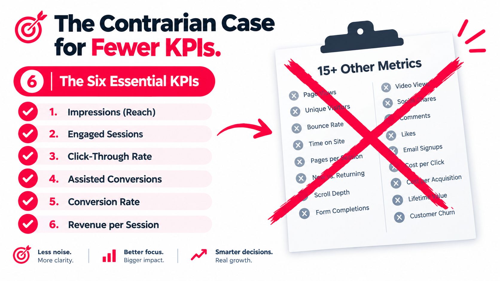
A working dashboard can begin with six decision-oriented measures:
- Impressions and reach: Confirm whether distribution is expanding toward the intended audience.
- Engaged sessions: Show whether social visitors do more than arrive and leave.
- Click-through rate: Identify content that creates movement from platform to owned property.
- Assisted conversions: Preserve contribution from content that influences a later conversion.
- Conversion rate: Test whether the destination and offer convert the traffic received.
- Revenue per session or post: Connect activity to commercial value when revenue data is available.
The exact set can change with the business model. A creator selling directly may prioritize revenue per post, while a coach collecting applications may emphasize booked calls. The common requirement is that every KPI must survive a weekly decision test.
Keep, drop, validate
Keep a metric when it can trigger an action within the next review cycle. Drop a metric that exists mainly to reassure the team or decorate a client report. Validate any cross-platform number against its source and investigate differences instead of smoothing them away.
The 5% variance rule belongs here because trust is operational. The Improvado dashboard guidance recommends keeping variance under 5% for core totals such as sessions, conversions, and revenue, while the cross-platform social media marketing analysis from Socialinsider emphasizes platform-specific baselines for engagement, reach, follower growth, and posting frequency.
If a KPI can't be tied to a decision made this week, it doesn't belong on the main screen.
A Practical Rollout Checklist for Your First Dashboard
Build the dashboard in an order that protects data quality. A polished interface can't repair missing tags, ambiguous definitions, or an owner who doesn't know how a metric was collected.
Start with lineage
For every KPI, record three things:
- Source: Native platform, analytics property, CRM, store, or payment system.
- Definition: The exact formula and inclusion rules.
- Owner: The person responsible for checking the number and acting on it.
Then compare native totals with the third-party dashboard. Treat a variance above 5% as a tracking issue to investigate, not as a harmless difference. Check date ranges, timezone settings, filters, bot treatment, API delays, and event deduplication before changing the definition.
Build the operating layer
Apply the UTM naming convention to every outbound campaign. Confirm that redirects preserve parameters, landing pages receive them, forms store them, and CRM records pass them into reporting. Run a test click and conversion before launching content.
Review the dashboard weekly. Ask which content created meaningful traffic, which posts assisted conversions, where tracking broke, and what action follows from the result.
Use the first 90 days deliberately
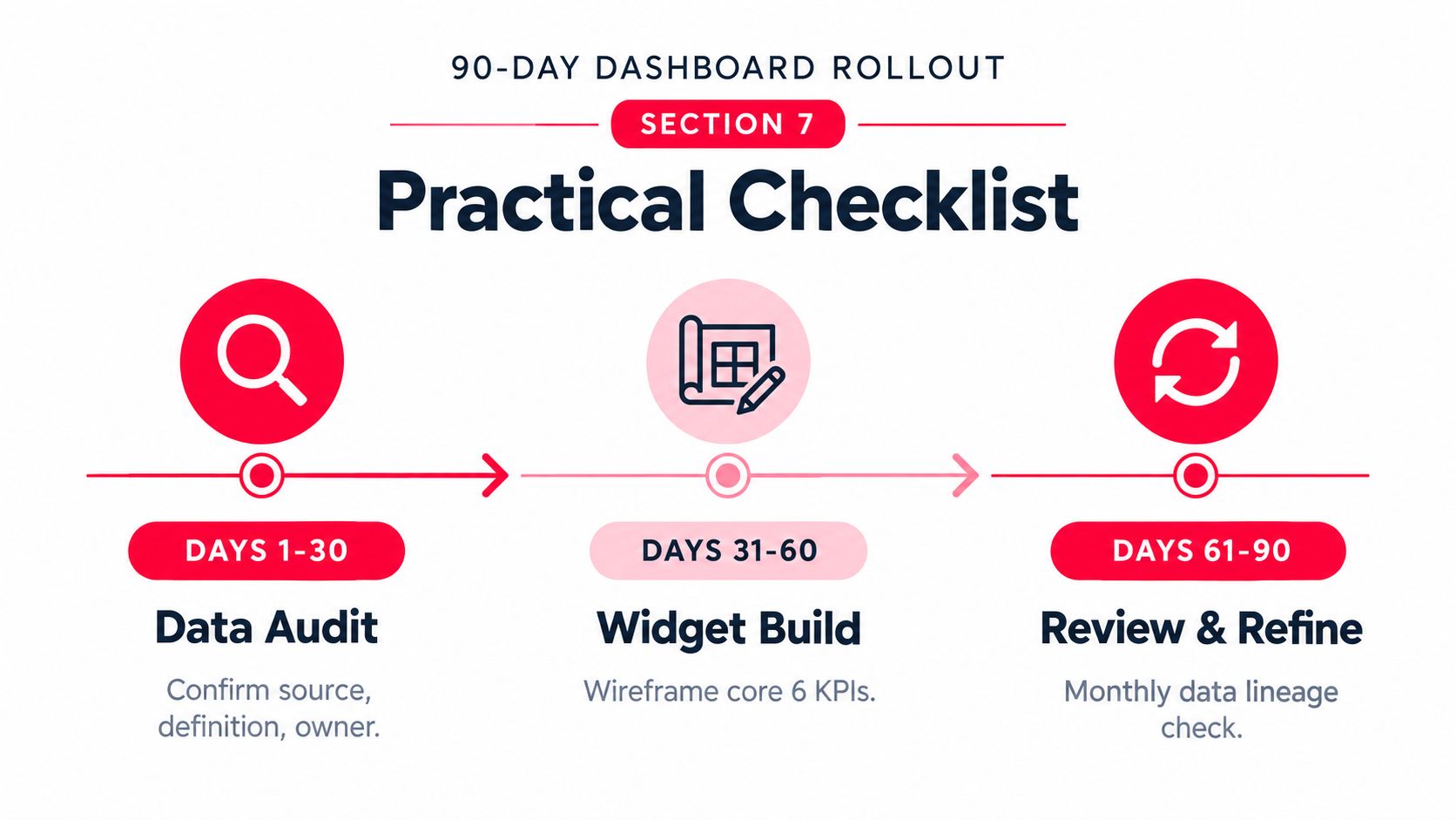
During weeks one through two, validate metric definitions, source connections, ownership, and time settings. During weeks three through six, refine attribution, test event persistence, and resolve source discrepancies. During weeks seven through twelve, retire KPIs that haven't supported decisions and promote signals that consistently guide content or budget choices.
ViewsMax is one option for creators who want to plan and publish across channels while monitoring clicks, calls booked, and attributed revenue in one place. Visit ViewsMax to connect your content workflow with the attribution signals that show which posts are doing the selling.