Most advice about TubeBuddy for YouTube is stuck in the past. It still treats thumbnail A/B testing as the decisive reason to subscribe, even though YouTube's native Test & Compare has absorbed much of that job. The better question in 2026 isn't whether TubeBuddy can optimize a video. It can. The question is whether its remaining workflow shortcuts save enough time, across enough uploads and channels, to justify another subscription.
That distinction matters because optimization and business measurement aren't the same thing. TubeBuddy can help you research keywords, clean up metadata, compare test variants, and manage a catalog. It won't automatically tell you which video drove a product sale, booked a call, or justified a sponsorship. If you're publishing for revenue, not only rankings, you need to evaluate TubeBuddy as one layer in a larger operating system.
Why TubeBuddy Still Matters in 2026
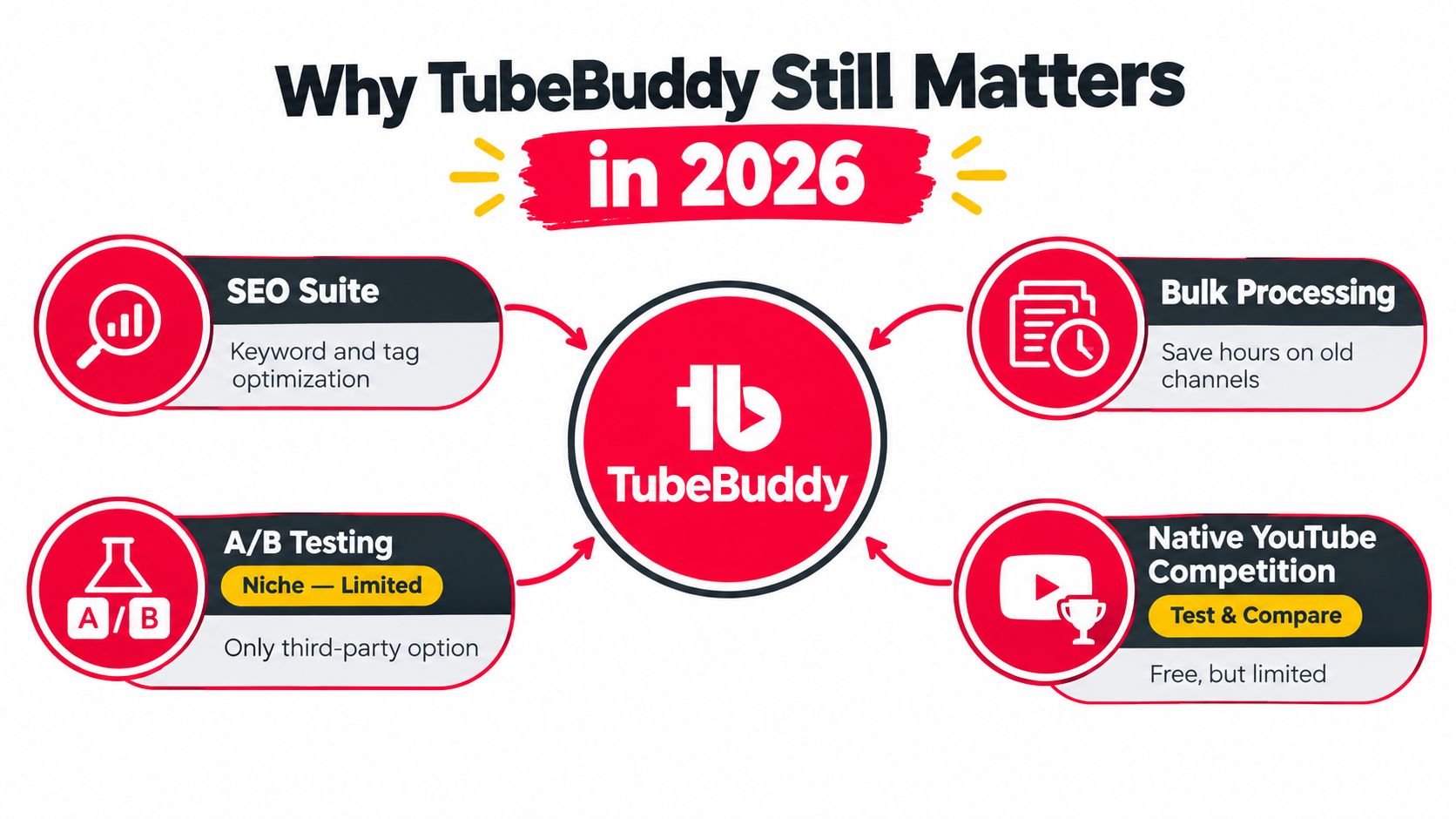
TubeBuddy's famous advantage is no longer enough to justify a subscription. YouTube's native Test & Compare now lets creators test thumbnails, so a third-party thumbnail feature has lost much of its former appeal. An independent TubeBuddy review reaches the same conclusion, describing thumbnail testing as a weaker differentiator now that YouTube handles much of the job itself.
TubeBuddy still earns its place as a workflow utility. Its practical value sits in repetitive channel operations that YouTube Studio handles less efficiently, including bulk metadata edits, tag organization, channel audits, and optimization prompts during upload. That matters most for creators managing a substantial video library or publishing across multiple channels.
TubeBuddy was founded in 2014 and acquired by BEN on October 29, 2020, according to an independent company profile (TubeBuddy company history). The product developed alongside more professional YouTube operations, where maintaining a growing catalog created work beyond writing titles and selecting keywords. Its broad creator adoption shows that the utility scaled, but adoption alone does not justify a paid plan for every channel.
The remaining reasons to keep it
The strongest case appears after a channel has accumulated a library. Updating cards, end screens, descriptions, and other metadata one video at a time consumes attention better spent on scripting and publishing. Bulk processing turns that maintenance into a repeatable task.
Keyword suggestions and tag workflows remain useful when they support a defined publishing plan. They can help compare candidate phrases and keep metadata consistent, but they cannot fix weak topics, unclear positioning, or videos that fail to deliver on the title. TubeBuddy's milestone system also presents growth through concrete markers such as subscribers and views, including public examples of a channel reaching 870,000 subscribers and 27,000,000 views (TubeBuddy milestone pages).
Practical rule: Pay for TubeBuddy when it removes recurring channel work. Do not pay because an extension displays an SEO score.
Revenue attribution remains the missing piece. A higher tag score, stronger click-through rate, or cleaner catalog does not prove that a video generated a product sale, booked a call, or supported a sponsorship. Creators publishing for revenue should judge TubeBuddy as an operations layer, then measure business outcomes elsewhere. Once optimization stops being the main constraint, production, offers, and attribution deserve the attention.
How TubeBuddy Fits Into a Creator's Workflow
TubeBuddy earns its place as a recurring workflow utility, not as a browser extension installed once and ignored. The extension handles tasks within YouTube, while the web dashboard supports broader reporting and channel management. Give each visit a clear trigger, or the tool becomes another tab competing for attention.
The night before publication
Research the topic before opening the upload page. Use Keyword Explorer and related discovery tools to compare possible phrases, then choose a subject that fits your audience and the video you can produce. Keyword data should shape the framing, not force an awkward title that the video cannot support.
Planning belongs beside production. If you're creating videos for your campaign, define the audience action and content angle before polishing metadata. A keyword may earn a click, but the opening, structure, and offer determine whether that attention produces a useful result.
During the upload
The browser extension places optimization prompts inside YouTube's publishing flow. Review suggested tags, title wording, description structure, and the checklist while the video is still being prepared. That placement reduces context switching and makes routine metadata decisions faster.
Treat the score as a checklist, never as a verdict. YouTube's native Test & Compare has absorbed much of the attention once associated with TubeBuddy's testing tools, so TubeBuddy's remaining advantage is workflow speed and organization. A high score cannot repair a vague promise, weak thumbnail, or topic that misses subscriber interests. For more browser-based workflow ideas, see this guide to Chrome extensions for YouTubers.
Weekly and monthly maintenance
Reserve a regular session for older uploads. Bulk tools can update descriptions, cards, end screens, and other repeated elements across a catalog. For a channel with a growing library, that maintenance can justify a paid license more clearly than another keyword suggestion.
Use the dashboard for channel-level review instead of checking videos at random. On a scheduled review day, find titles with weak impressions-to-click performance, compare their packaging with stronger uploads, and create a short test list. TubeBuddy's milestone data typically refreshes every two hours, while some externally sourced view metrics can lag 24 to 48 hours, according to its support documentation.
Track revenue separately. Better packaging or cleaner metadata does not prove that a video generated a sale, booked a call, or supported a sponsorship. Once optimization stops limiting growth, shift attention to production, offers, and attribution.
The Four Core Feature Areas Explained
TubeBuddy is easier to judge by workflow than by feature count. Its tools fall into four jobs: researching a topic, maintaining a video library, testing packaging, and reading channel performance. The first and third attract attention, but bulk maintenance is often the clearest reason to pay.
Keyword and tagging tools
The keyword group covers keyword exploration, upload-time tag suggestions, saved tag lists, and search-rank tracking. These features help an active creator compare wording quickly after the niche and audience are already understood. They cannot supply a content strategy by themselves.
Use a separate foundation for YouTube video keywords before treating any TubeBuddy score as a decision. Search volume, phrasing, audience intent, and the strength of competing videos matter more than a single rating.
The paid limits also deserve attention. Independent reviews note that the free tier's keyword allowance can run out quickly, while paid access depends on the selected plan and available features (TubeBuddy review and limitations). A subscription does not remove the need to choose research targets carefully.
Verdict: Pay for keyword access when the channel publishes around a repeatable topic strategy. Do not buy it in the hope that tags will reveal the strategy.
Bulk processing and catalog maintenance
Bulk operations are TubeBuddy's strongest remaining paid use case. Depending on the plan, creators can update cards, end screens, descriptions, thumbnails, comments, and other channel settings across multiple videos. The value comes from removing repetitive edits, not from adding another dashboard.
This feature becomes more useful as the catalog grows. A creator changing an offer, replacing a destination page, or standardizing descriptions can apply the same maintenance pattern across selected uploads instead of opening each video individually. Agencies and channel managers also gain time when similar updates repeat across client libraries.
Set the affected video group before applying a broad change, and preserve the original format in a record. A fast bulk edit can create a larger cleanup task if the selection or replacement text is wrong.
Verdict: Bulk editing is the clearest reason to move beyond free access for a mature catalog.
A/B testing
TubeBuddy's testing tools compare metadata variants on a scheduled cycle, often changing the active version once per day at a set time. The system can stop after a selected duration or after reaching statistical significance. Results therefore reflect day-level sampling rather than continuous randomized traffic allocation.
The reporting view includes click-through rate, watch time per impression, engagement rate, daily impressions, clicks, and total views for each variant. It can also separate results by traffic source or subscriber status, helping identify whether a result came from discovery, returning viewers, or external promotion (TubeBuddy YouTube A/B testing overview).
YouTube's native Test & Compare has absorbed much of the attention once attached to TubeBuddy's testing feature, especially for thumbnail experiments. TubeBuddy still fits creators who want testing inside a wider publishing workflow or who value third-party reporting. It is a weak subscription reason when thumbnail comparison is the only job.
Verdict: Use A/B testing to answer a specific packaging question. Do not make it the central reason to subscribe.
Analytics and channel health
TubeBuddy's analytics tools combine packaging signals with channel diagnostics. Comparing click-through rates, viewing performance, and health indicators can show where an upload deserves attention. The useful output is a decision, not a score.
A weak title may call for a rewrite. A thumbnail problem may require a new visual idea. Low retention may point to the opening, while weak topic selection requires a change before the next upload. Revenue attribution still sits outside this optimization layer, so connect these findings with sales, bookings, affiliate activity, or sponsorship outcomes in a separate measurement system.
| Feature Area | What It Does | 2026 Verdict |
|---|---|---|
| Keyword and tagging | Supports keyword exploration, tag suggestions, lists, and rank tracking | Useful for active channels with a defined niche |
| Bulk processing | Updates repeated metadata and channel elements across a library | Strongest paid justification |
| A/B testing | Compares variants on a scheduled testing cycle | Helpful, but no longer uniquely necessary |
| Analytics | Surfaces packaging, engagement, and channel-health signals | Valuable when tied to concrete actions |
Verdict: Analytics can sharpen publishing choices, but optimization does not prove business impact. Once packaging stops limiting growth, measure revenue and improve the offer, production, and attribution system.
Two Creator Workflows in Practice
Feature lists become useful only when they fit a real publishing day. Consider a gaming creator who publishes twice each week. The creator researches a target phrase before recording, checks related suggestions, and saves a short list of relevant tags for the upload rather than stuffing every possible phrase into the metadata.
During publishing, the creator uses the extension to review the title, description, and tags inside YouTube Studio. The thumbnail goes into a TubeBuddy test only when the packaging question is specific, such as whether a character-focused image outperforms a result-focused image. After the test runs, the creator reviews click-through rate, watch time per impression, and traffic-source segments instead of selecting a winner based on clicks alone.
The following week, the creator turns the result into a publishing decision. If one concept attracts discovery traffic but weakens viewing quality, it shouldn't automatically become the default. If the result is unclear, the creator keeps the stronger editorial version and tests a different variable later.

A small ecommerce channel
Now take a product-review creator with a substantial backlog. The immediate problem isn't finding another keyword. It's that older videos point viewers toward outdated cards and end screens.
The creator first exports or reviews click-through information to identify videos that still attract attention but send viewers nowhere useful. Next, they use bulk editors to update cards and end screens across the relevant catalog. Titles that remain weak after the destination cleanup go into a separate review list, where the creator changes metadata in batches rather than editing unrelated videos.
The free tier becomes a constraint when research, testing, or batch actions exceed the available allowance. That's the decision point. If the creator performs this maintenance once and never returns, a temporary upgrade may be enough. If catalog cleanup is part of every month's operating routine, a paid plan has a more defensible role.
The right workflow starts with a business or audience problem, then selects the TubeBuddy feature that removes the bottleneck.
TubeBuddy Pricing Tiers Compared
TubeBuddy's plan names are easier to understand when you ignore the promotional hierarchy and map them to actual work. Free access suits basic experimentation. Pro is aimed at creators who need more regular optimization and productivity support. Star and Legend are for deeper access, heavier testing, broader reporting, or more advanced channel operations, depending on the current plan configuration.
The licensing model deserves attention before you subscribe. A standard license is tied to one YouTube channel, not to an account, according to TubeBuddy's pricing information (TubeBuddy pricing and plan details). If you operate multiple channels, calculate the workflow value per channel rather than assuming one subscription covers everything.
| Feature | Free | Pro | Star | Legend |
|---|---|---|---|---|
| Core optimization | Basic access | Broader creator tools | Expanded access | Full advanced access |
| Keyword research | Limited | More practical for active use | Deeper access | Full search and SEO access |
| Bulk operations | Limited or unavailable | Select productivity features | Broader editing access | Advanced bulk processing |
| A/B testing | Limited or unavailable | Plan-dependent access | Expanded access | Highest available access |
| Analytics | Basic channel signals | More reporting | Deeper reporting | Advanced analytics |
| Best fit | New or occasional creators | Consistent single-channel creators | Serious operators | Advanced creators and larger workflows |
The exact feature mix can change, so check the live plan comparison before paying. Don't buy Star or Legend because the feature list looks complete. Buy them only when a specific recurring task, such as deeper reporting, broader testing, or catalog operations, is blocked by a lower tier.
Who should stay with Pro
Pro is usually enough for a creator who manages one channel, publishes consistently, and wants keyword tools plus practical productivity features. It's also the sensible starting point for testing whether TubeBuddy becomes part of your routine. If you don't use the extension during uploads or schedule maintenance sessions, a higher tier won't fix the adoption problem.
Who needs an upper tier
Higher tiers make sense for creators who run frequent controlled tests, manage complex catalogs, or need advanced reporting. They may also suit agencies and channel operators, but per-channel licensing can make the economics less attractive as the channel count grows.
A simple rule works well: choose the lowest tier that supports the workflow you'll repeat every week. Upgrade only after you can name the blocked task and estimate the time it costs you.
Honest Pros and Cons for Today's Creators
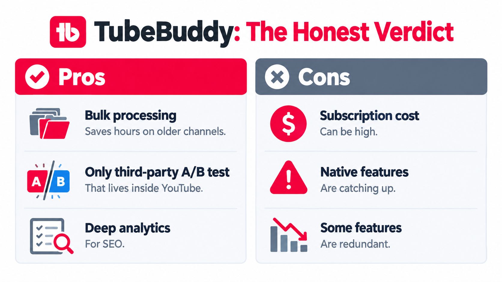
TubeBuddy's value has shifted. It still handles repetitive YouTube work better than Studio, especially once a channel has enough videos for manual edits to become a real operational burden. Keeping optimization prompts beside the upload workflow also reduces context switching.
Its strongest case now is workflow management, not thumbnail testing alone. TubeBuddy organizes testing and reporting more clearly than a casual native workflow, while YouTube's Test & Compare has absorbed much of the feature that once made TubeBuddy an obvious purchase. The company has grown from its 2014 launch into a platform positioned for millions of creators, but that history does not justify paying for features you will not use.
Where it falls short
The larger weakness is strategic. TubeBuddy can improve known content, yet it does not show which video produced a sale, membership, or lead. Better titles and thumbnails may raise performance without answering whether the resulting attention created revenue. Pair optimization with attribution once the channel supports a business, not just an audience.
Pricing and licensing add friction. Per-channel access, sharp tier jumps, and keyword limits can matter when the tool becomes part of a serious routine. One channel may absorb those costs more easily. Several channels make separate licensing harder to justify.
Start with YouTube's native Test & Compare if thumbnail testing is your only reason to subscribe. TubeBuddy earns its place when bulk editing, channel maintenance, and broader reporting save time every week.
Maturity test: TubeBuddy suits creators who know what they want to test. It cannot replace learning why viewers choose, watch, and buy.
TubeBuddy Versus ViewsMax and Other Alternatives
TubeBuddy and VidIQ are usually compared as if the winner must own every part of the YouTube workflow. That framing is too narrow. Both tools focus primarily on discovery, optimization, packaging, and competitive signals. The more important question is what happens after a viewer clicks.
TubeBuddy can help you improve the path from topic to search visibility to packaging. VidIQ provides another optimization approach with its own research and competitor-oriented workflows. Neither category automatically proves that a video generated a sale, lead, booked call, or partner outcome.
ViewsMax belongs downstream from optimization. It provides attribution tracking that lets creators create trackable links, place them in descriptions, bios, and posts, and connect clicks, leads, and sales to content. That makes it a different layer, not a direct replacement for keyword research or channel maintenance.
| Tool | Primary Focus | Pricing Model | Best For | Main Limitation |
|---|---|---|---|---|
| TubeBuddy | YouTube optimization and workflow management | Tiered creator licenses | Metadata, bulk maintenance, testing, and channel operations | Doesn't by itself prove revenue attribution |
| VidIQ | Topic discovery, keyword research, and competitor analysis | Tiered subscription | Creators seeking research and idea support | Optimization signals don't equal sales proof |
| ViewsMax | Content attribution and publishing workflow | Product-specific subscription model | Creators connecting content to clicks, leads, and revenue | Not a replacement for YouTube SEO tooling |
The right stack depends on the job. A new creator may need only YouTube Studio and basic TubeBuddy support. A research-heavy channel might compare TubeBuddy with VidIQ, but using both can create duplicate dashboards unless each tool has a clearly assigned role. Once monetized traffic matters, add an attribution layer so packaging improvements can be judged by business outcomes.
Creators buying promotion or building paid distribution should also separate content optimization from audience targeting. A practical guide to finding effective YouTube Ads targeting can help with the media side, while TubeBuddy remains focused on the channel and ViewsMax tracks downstream actions.
For a broader tool comparison, use this guide to the best YouTube SEO tools. The key decision isn't which dashboard has the most features. It's whether you need better discovery, faster channel operations, or proof that content produces revenue.
Choosing the Right Path for Your Channel Stage
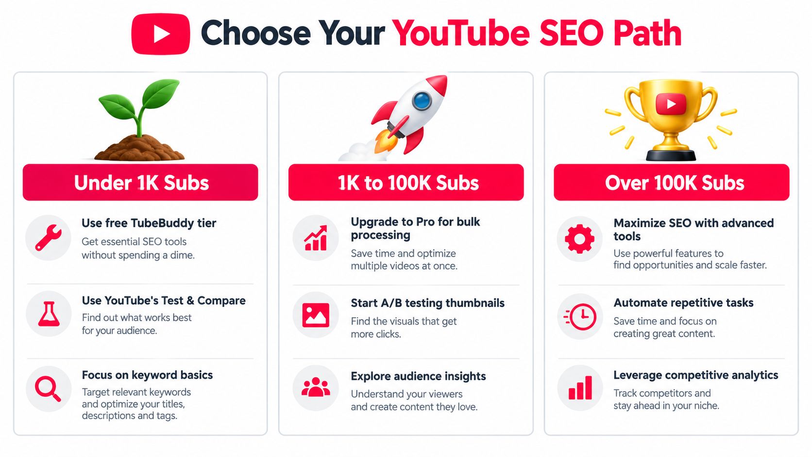
A small channel shouldn't buy an advanced workflow before it has a publishing habit. If you're under 1,000 subscribers, start with TubeBuddy's free tier and YouTube's native Test & Compare. Focus on clear topics, accurate titles, useful descriptions, and consistent calls to action. Use your time to publish and learn what your audience responds to, not to maintain a complicated optimization stack.
The growing channel
Between 1,000 and 10,000 subscribers, TubeBuddy Pro can become useful if you publish consistently and need stronger keyword workflows, tag lists, or recurring catalog maintenance. The upgrade should follow a real bottleneck. If uploads are irregular and you rarely review old videos, the paid features will sit unused.
Build a simple weekly rhythm:
- Before recording: Choose the topic and audience promise.
- Before publishing: Review title, description, tags, and thumbnail.
- After publishing: Record the result and identify one packaging question.
- During maintenance: Update cards, end screens, or descriptions where the next action has changed.
The size of the channel matters less than the complexity of the operation. A smaller channel with a large catalog may benefit from bulk editing sooner than a larger channel with a simple publishing model.
The monetized channel
Once you're above 10,000 subscribers and monetized, stop treating optimization as the complete growth system. Better titles and thumbnails still matter, but their value should be measured against the revenue or business outcome they support. If sponsorships require performance proof, you manage multiple revenue streams, or you need to compare YouTube earnings with product sales, TubeBuddy alone is no longer enough.
Watch for these signals:
- Revenue ambiguity: You can see views but can't identify which videos drive sales.
- Sponsor pressure: Partners ask for performance evidence beyond reach and impressions.
- Offer changes: Your descriptions and calls to action change often across the catalog.
- Multiple channels: Separate licenses and separate dashboards create management friction.
- Operational overload: Repetitive updates take time away from production and sales.
This week, audit one channel and write down the exact task slowing you down. If it's metadata maintenance, test the lowest TubeBuddy tier that supports it. If it's revenue attribution, build trackable links and connect them to the videos promoting your offer. Don't upgrade because a competitor's feature list looks impressive. Upgrade when your workflow has a measurable gap.
ViewsMax helps creators connect content to clicks, leads, and sales through trackable links, publishing workflows, and performance reporting. If TubeBuddy shows you how to optimize a video, ViewsMax helps you evaluate whether that content is producing business results.