ViewsMax
Sign In Sign Up Free

Tag: youtube ctr

  • A Guide to Effective YouTube Thumbnail Preview Tactics

    A Guide to Effective YouTube Thumbnail Preview Tactics

    Your YouTube thumbnail is your video's first impression. It’s the single most important factor that determines whether someone clicks on your content or just keeps scrolling. A thumbnail preview is simply a way to see exactly how that image will look in the wild—on a phone, on a desktop, in search results—before you hit publish. Skipping this step is one of the easiest ways to kill a video's potential.

    Why Your Thumbnail Preview Is Your Most Important Click Signal

    A hand holds a smartphone displaying a video preview with a 'First Click Signal' red banner.

    Think of your thumbnail as a digital handshake. A preview ensures it’s a firm one. I’ve seen it a hundred times: a design that looks incredible on a big 27-inch monitor becomes a blurry, unreadable smudge on a mobile screen. And since that's where most people watch YouTube, you've just lost a massive chunk of your audience.

    Previewing isn't just about ticking a box. It's about stress-testing your video's most critical marketing asset. Using a youtube thumbnail preview reveals the kind of fatal flaws that sink a video's performance before it even has a chance.

    Catching Critical Design Flaws Early

    A quick preview helps you spot common click-killers that are surprisingly easy to miss when you're staring at a full-size design file. These aren't just minor tweaks; they're the difference between a click and a scroll.

    Here are the most common issues a preview will immediately expose:

    • Poor Readability: That stylish, thin font you love? It’s completely illegible when shrunk down. Text that's too small or blends into the background is an instant turn-off.
    • Weak Color Contrast: Colors that look vibrant on your design software can appear muddy and dull on a smaller phone display, failing to grab anyone's attention in a crowded feed.
    • Confusing Composition: A cluttered design is an immediate "no." If a viewer can't understand what your video is about in a split second, they're gone.
    • Lack of Emotional Appeal: Does the face in your thumbnail look genuinely excited or just a bit awkward? A preview helps you gauge the immediate emotional hook of your image.

    Your thumbnail isn’t just a static image; it’s an advertisement for your content. If the ad is unappealing or confusing, the product behind it—your video—never gets a chance to shine.

    Connecting Previews to Algorithm Success

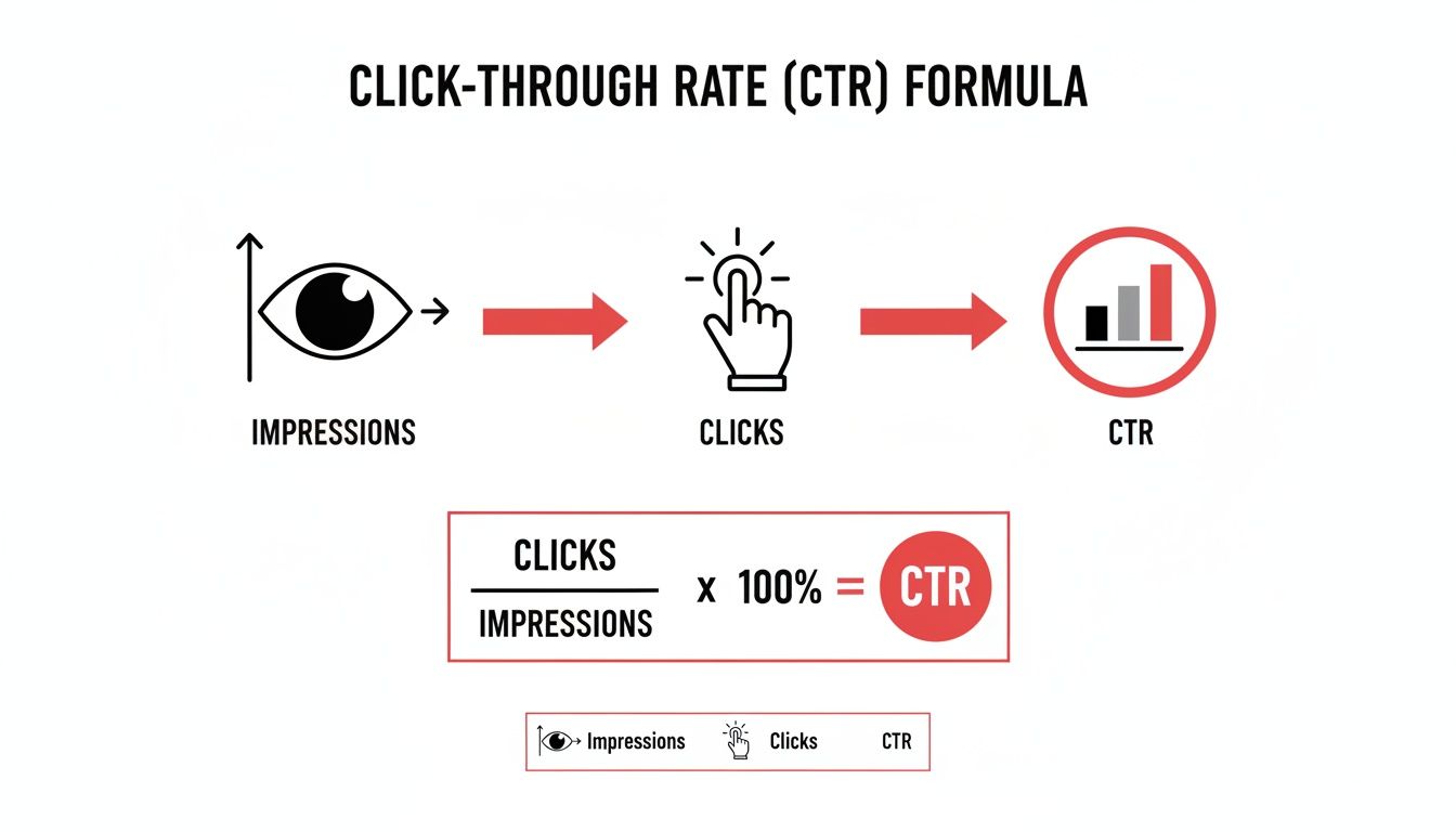
    This whole process ties directly into what the YouTube algorithm cares about most. The platform wants to keep users engaged, so it promotes videos that people actually click on. That all comes down to one key metric: click-through rate (CTR). This is the percentage of people who see your thumbnail and choose to watch.

    A high CTR is a massive signal to YouTube that your content is compelling. The algorithm responds by showing your video to more people in recommendations and search results. So, spending a few extra minutes previewing your thumbnail isn't just about making things look pretty—it's a direct strategy to feed the algorithm what it wants and boost your video's reach.

    To really dig into this, you need to understand the bigger picture of how to improve click-through rates. When you nail this one element, you turn a simple design check into a powerful engine for channel growth. We also cover more on this in our deep-dive on how to improve your YouTube click-through rate.

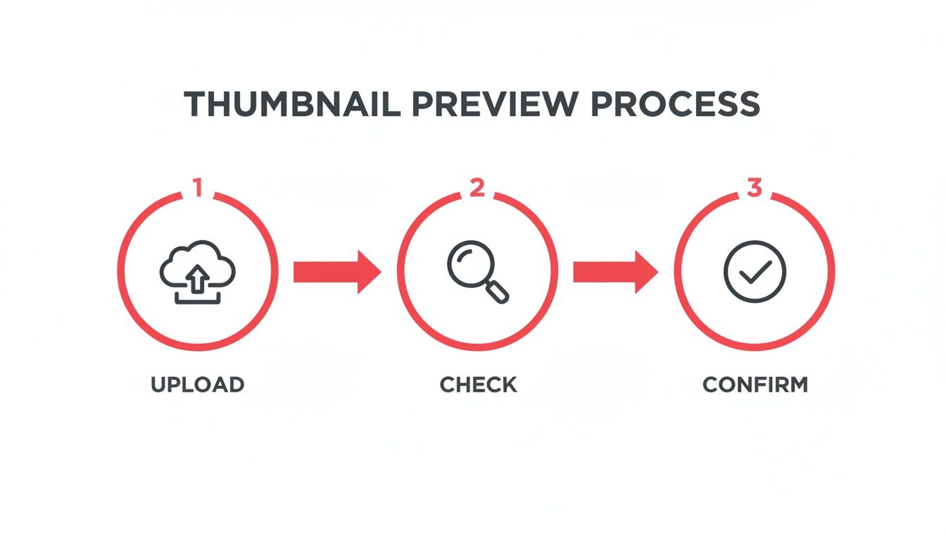
    Using YouTube Studio for Your First-Look Preview

    Before you even touch an outside tool, your most important YouTube thumbnail preview is waiting for you right inside YouTube Studio. I can't stress this enough—this is your first line of defense against easy-to-avoid design mistakes. It’s the foundational check every single creator should make, every single time.

    When you upload a video and head to the ‘Details’ page, you’ll find the thumbnail section. Once you've uploaded your custom image, stop and really look at the small preview that pops up. Don't just glance. Scrutinize it. Is any part of your design getting awkwardly cut off? Are the colors showing up how you expected, or do they look a little muddy?

    This initial check catches more problems than you'd think. I've had designs that looked absolutely perfect in Photoshop, only to reveal a slight misalignment or a funky color balance once YouTube processed the file.

    Adhering to YouTube’s Technical Specs

    Getting that first preview right usually comes down to one thing: respecting YouTube's technical requirements from the very beginning. These aren't just suggestions; they are hard-and-fast rules to prevent compression from turning your sharp design into a blurry mess. Ignore them, and you could kill your click-through rate before the video even goes live.

    YouTube’s specs are all about making sure your thumbnail looks crisp everywhere.

    • Resolution: 1280×720 pixels
    • Aspect Ratio: 16:9
    • Minimum Width: 640 pixels
    • File Size: Under 2MB

    These numbers aren't random. They ensure your image looks pixel-perfect across the Home feed, in the Recommended sidebar, and especially on mobile devices, where over 70% of views now happen. Sticking to these guidelines is non-negotiable.

    Your YouTube Studio preview is your ground truth. If the thumbnail looks weak or blurry here, it will look even worse out in the wild on the YouTube homepage.

    This simple, built-in preview is your first chance to spot a problem and fix it. If you want to get into the nitty-gritty of sizing, check out our detailed guide on YouTube video thumbnail sizes. Nailing this first step inside the Studio builds a solid foundation before you start simulating how it will look on different devices.

    Simulating Previews Across Different Devices

    A thumbnail that looks fantastic blown up on your 27-inch monitor can easily become an unreadable, blurry mess on a smartphone screen. This is where the real work begins. To make a thumbnail that truly performs, you have to simulate how it will actually look to a viewer, ensuring it pops no matter where they're scrolling.

    Think of it as stress-testing your design. This simple sanity check is your last line of defense against fuzzy text, muddled colors, or a composition that just doesn't land before you hit publish.

    A three-step infographic showing the thumbnail preview process: upload, check, and confirm.

    Treating this as a deliberate quality control workflow—not just a quick glance—is what separates the pros from the amateurs.

    Mastering The Desktop Browser Preview

    You don’t need any fancy software to get a solid idea of how your thumbnail will look on mobile. Your web browser already has surprisingly powerful tools built right in. My personal go-to for a quick and dirty mobile check is the "Inspect" feature in browsers like Google Chrome. It's a simple trick that tells you so much.

    Here’s how you can do it yourself:

    • First, open your thumbnail image file directly in a new browser tab.
    • Right-click anywhere on the image and choose "Inspect" from the context menu.
    • A developer panel will pop up. Look for an icon that resembles a phone and tablet (Toggle device toolbar) and click it.
    • From there, you can use the dropdown to select different device presets like "iPhone 12 Pro" or "Pixel 5" to see exactly how your design scales down.

    Look closely. Is your text still legible? Does the key subject of the image still command attention? This one check often reveals that a font needs to be bumped up a few points or an element needs to be enlarged to make an impact.

    The Shrink-And-Squint Test

    Beyond simulating specific phones, you have to remember where your thumbnail will live: in crowded YouTube feeds. It will be a tiny rectangle competing for attention in the "Up Next" sidebar, search results, and the homepage. In these spots, it's incredibly small.

    That’s why I rely on a simple, low-tech method I call the "shrink-and-squint test."

    Just zoom out on your design in Photoshop or Canva until it’s roughly the size of a postage stamp. Now, take a step back and squint your eyes. Can you still immediately tell what the video is about? Can you still feel the emotion? If it just turns into a colorful blob, it’s not going to cut through the noise. This test forces you to prioritize a strong, simple composition that works at any scale.

    A great thumbnail should pass the squint test with flying colors. If the core message is lost when it’s small and blurry, it won’t stand a chance in a busy subscription feed.

    One final check is to account for YouTube’s own interface elements. The little timestamp in the corner can easily cover up a crucial word or part of your image. To avoid this, a YouTube Safe Zone Checker is invaluable. These tools show you exactly where overlays will appear, helping you keep your most important visual information safe and clear.

    Comparing Thumbnail Preview Methods

    Choosing the right preview method often depends on how much time you have and what you need to check. Below is a quick breakdown to help you decide which approach fits best into your workflow.

    Preview Method Best For Key Advantages Potential Limitations
    Browser Dev Tools Quick mobile screen simulation Free and built into your browser; shows accurate scaling on different devices. Doesn't simulate YouTube's UI (e.g., timestamps) or color profile changes.
    The "Squint Test" Checking overall composition & impact Fast, simple, and excellent for testing visual clarity and emotional punch at a distance. Highly subjective; doesn't provide precise technical feedback on legibility.
    Safe Zone Checkers Final design and layout checks Pinpoints exactly where YouTube's UI overlays will appear, preventing crucial elements from being covered. An extra step in the process; focuses on layout, not color or compression.

    Ultimately, a combination of these methods will give you the most complete picture. I'll often start with the squint test to nail the composition, then use browser tools for a mobile check, and finish with a safe zone checker before finalizing the design.

    Advanced Previews With Third-Party Tools

    While the browser "squint test" is a great gut check, dedicated third-party tools give you a serious competitive advantage. They go way beyond just resizing your image. These tools simulate exactly how your thumbnail will look in the wild—on the YouTube homepage, in search results, and on different devices—right next to the videos you're competing against.

    This youtube thumbnail preview in a real-world context is what separates a good thumbnail from a great one. It’s one thing to love your design on a big monitor in your editing software, but it's another to see it get completely lost next to a dozen other flashy thumbnails in a search results mock-up.

    Seeing your thumbnail in its natural habitat immediately answers the critical question: Does it pop, or does it blend in?

    Testing for Visual Clarity and Accessibility

    The best preview tools don't just show you what your thumbnail looks like; they help you diagnose potential problems. Two of the most powerful features I’ve come to rely on are the blur test and color simulators.

    • The Blur Test: This is a simple but brilliant feature. It adds a slight blur to your thumbnail to simulate what a viewer sees in a quick, subconscious glance. If you can still make out the main subject and feel the intended emotion, you've nailed the composition. If it just looks like a muddy mess, your design is probably too busy.
    • Color Simulators: It's easy to forget that a significant number of people have some form of color vision deficiency. These simulators show you what your thumbnail looks like to someone with conditions like deuteranopia (red-green color blindness). This helps you ensure your color choices and contrast work for everyone, not just a portion of your potential audience.

    This isn't just about nitpicking your design. It's about making smart, data-informed decisions before you publish. You're moving from hoping your thumbnail performs well to knowing it's been tested for real-world conditions.

    Finding the Right Tool for Your Workflow

    So, where do you find these features? Many platforms you might already be using have them built right in. Tools like Canva and TubeBuddy integrate device and feed simulations directly into their design process, which is incredibly convenient. You can also find standalone web apps designed specifically for this, where you just upload your image and get instant feedback.

    As you explore, think about how a tool fits into your overall optimization strategy. If you're really committed to growing your channel, you might want to check out some of the best YouTube SEO tools available, as many of them bundle these preview features with other powerful analytics.

    Ultimately, the goal is to find something that feels like a natural part of your process. Make this final preview a mandatory step on your pre-publish checklist. It’s a small habit that pays off with consistently stronger video performance and long-term channel growth.

    Actionable Principles for High-Impact Thumbnail Design

    A creative workspace featuring a laptop displaying a person's face, an open notebook, and a design checklist.

    A perfect youtube thumbnail preview is only half the battle; no amount of testing can salvage a thumbnail that’s weak, confusing, or just plain boring. The good news? You don't need to be a graphic design wizard to create something that works. It's really about understanding the psychology behind a click.

    Think of your thumbnail as a tiny billboard on a packed digital highway. You have a split second to grab someone's attention, communicate your video's value, and spark enough curiosity to earn that click. Every single element—from the colors to the text—has to work in harmony to stop the scroll.

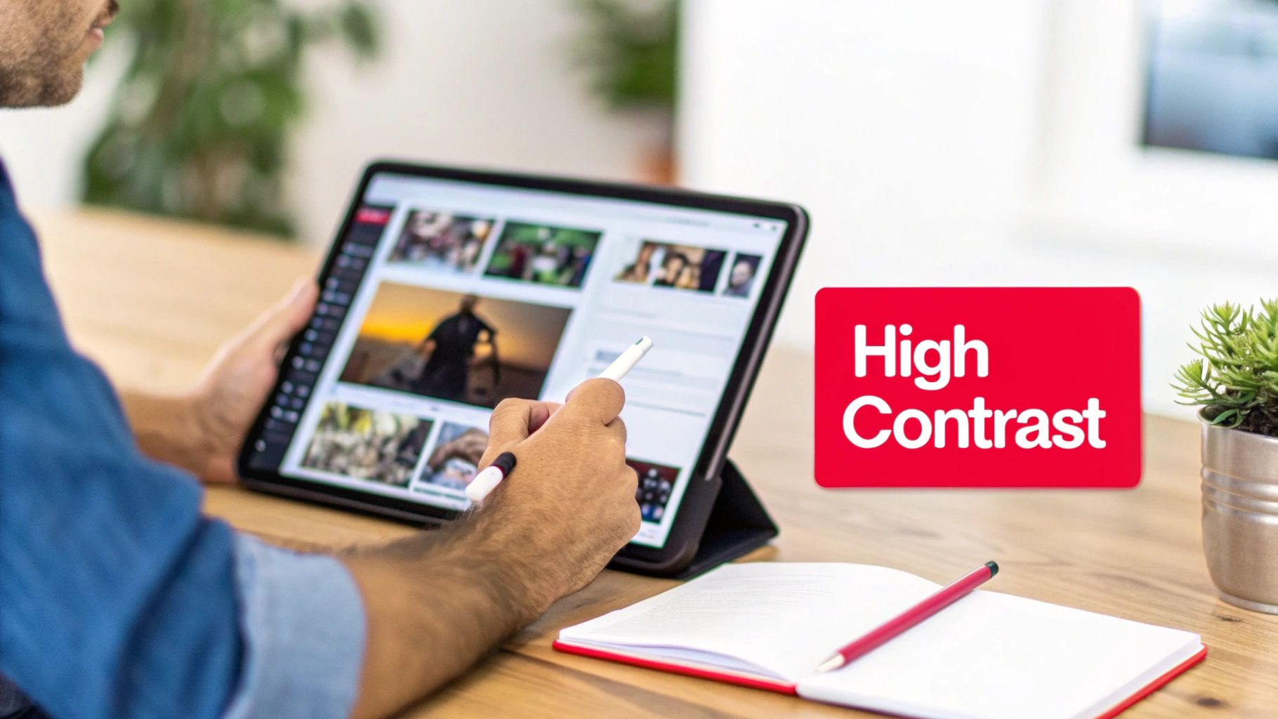
    Master Color and Contrast for Emotional Impact

    Color is your fastest way to set a mood without saying a word. Bright, saturated colors like yellows and reds can scream excitement or urgency. On the other hand, cooler tones like blues and greens often feel more professional, calm, or trustworthy. This isn't just about picking colors you like; it’s about choosing a palette that matches your video’s content and your channel’s vibe.

    But even more critical than the color itself is strong contrast. A light gray font on a white background might look slick on your big design monitor, but it turns into an unreadable smudge on a phone screen.

    • The High-Contrast Rule: Always place bright elements on a dark background or dark elements on a bright one. No exceptions.
    • Brand Consistency: Sticking to a consistent color palette helps viewers instantly recognize your content in a crowded feed. Over time, they'll spot your videos without even reading the title.

    This singular focus on contrast is what makes your thumbnail pop, even when it’s just a tiny rectangle in the "Up Next" sidebar.

    A great thumbnail should be just as clear in black and white. If you strip away the color and the composition still works, you know you’ve built a solid foundation.

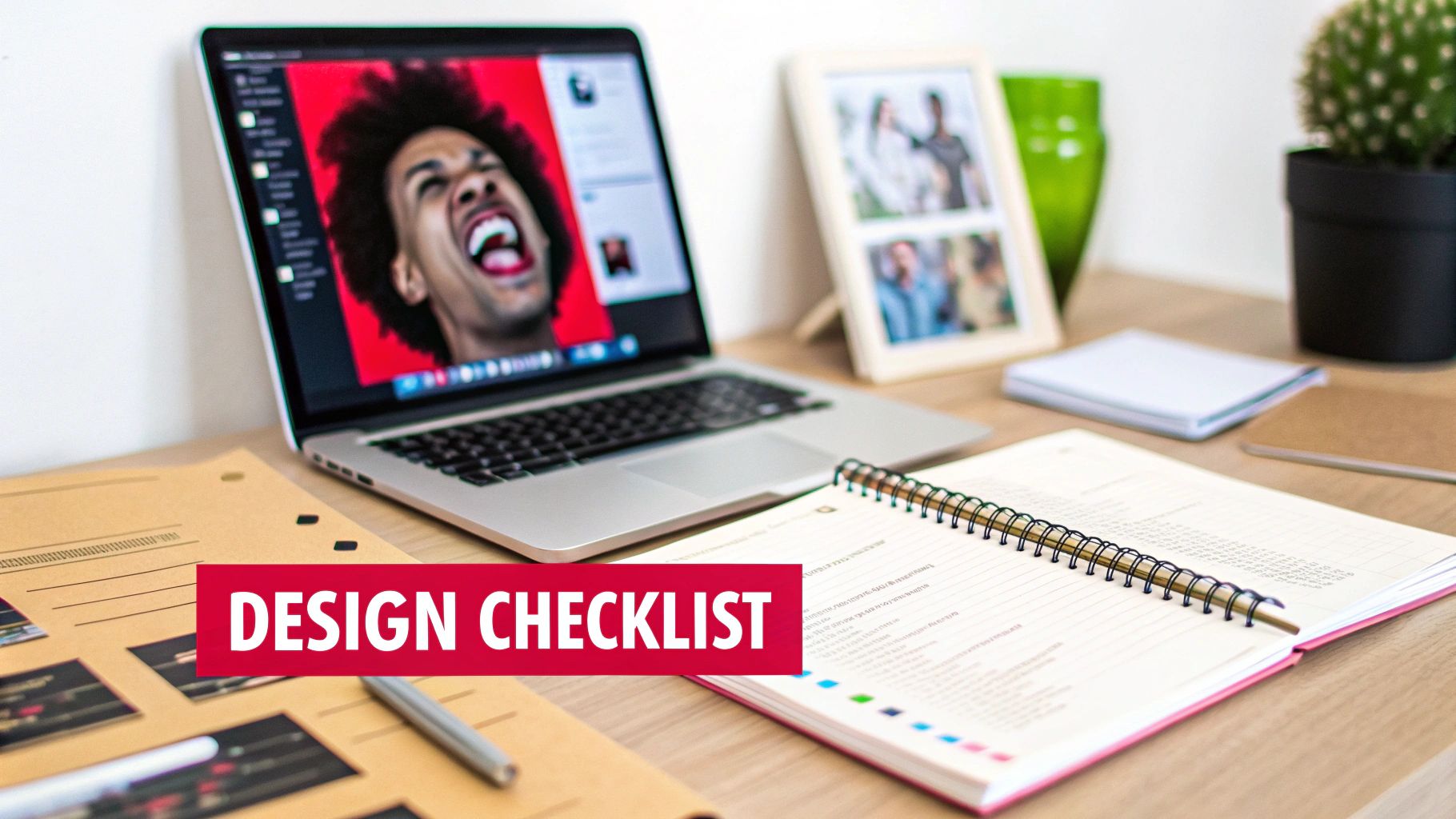
    The Power of Expressive Human Faces

    There’s a simple reason why so many of the most-clicked thumbnails feature a human face: our brains are literally wired to connect with them. A face showing genuine surprise, joy, or confusion is an emotional shortcut, telling the viewer exactly how they should feel about the content before they even read the title.

    The data strongly supports this. Time and again, research shows that thumbnails with expressive faces can boost click-through rates by a staggering 20-30%. A human face creates an immediate connection and piques curiosity in a way that objects or graphics rarely can. You can get a deeper look into these YouTube thumbnail best practices to see just how powerful this is.

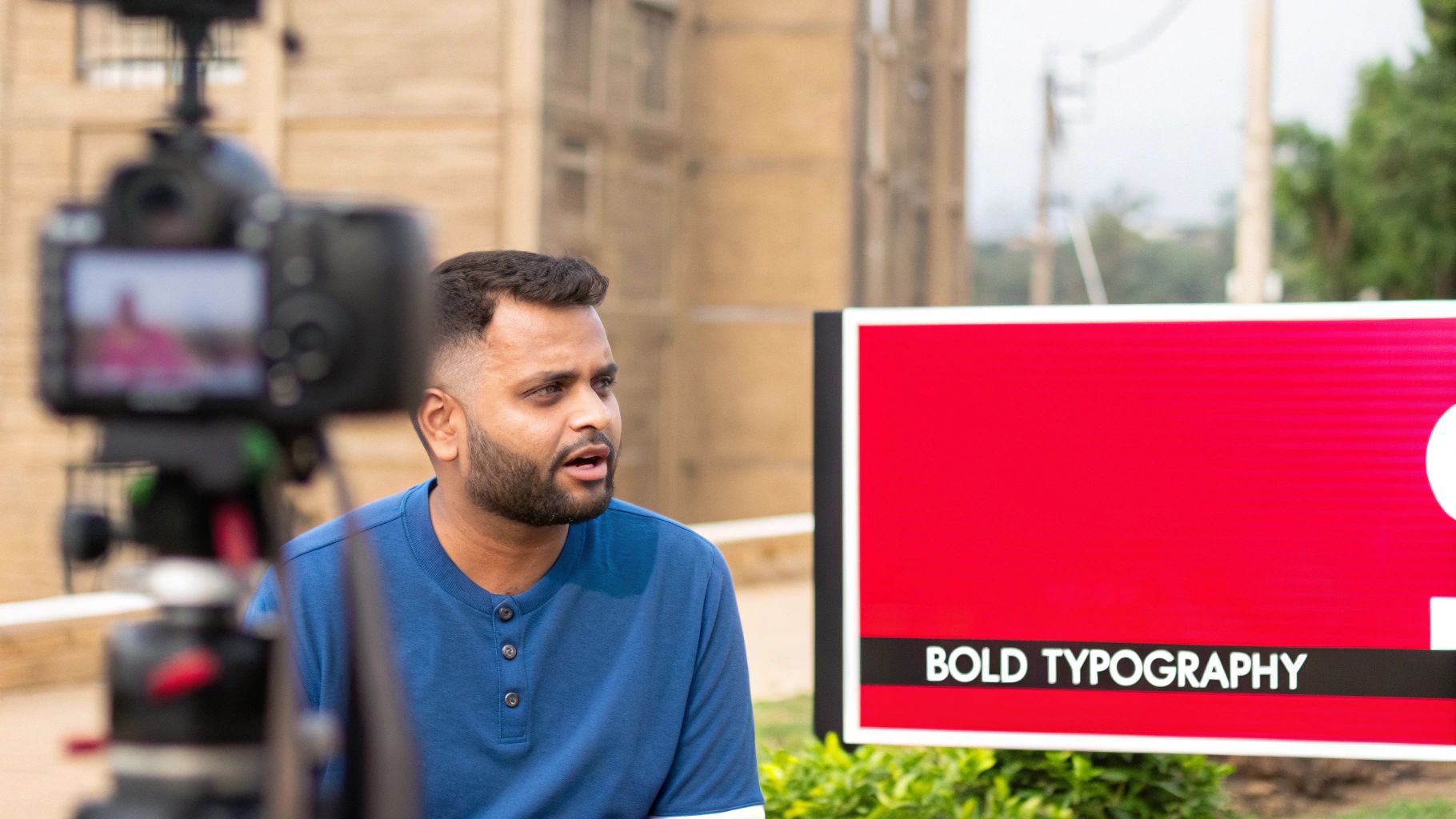
    Keep Text Bold, Minimal, and Clear

    When it comes to text on your thumbnail, less is always more. Your video's title is there for the details; the thumbnail text is your hook. Stick to just a few powerful words that add critical context or create a curiosity gap that the title can’t.

    Your text absolutely must be:

    • Large and Bold: Use a thick, clean font that’s easy to read even when shrunk down to the size of a postage stamp.
    • Concise: Seriously, aim for 3-5 words at the most. Think "MIND BLOWN" or "HUGE MISTAKE," not a full sentence.
    • Outlined or Shadowed: Adding a simple stroke or drop shadow makes your text pop right off the background, ensuring it’s readable no matter what image is behind it.

    This is no place for delicate, artsy fonts. Readability beats style every single time. Combine these three pillars—strong contrast, an emotional face, and minimal text—and you’ll have a thumbnail that’s not just designed to look good, but engineered to perform.

    Questions Creators Often Ask About YouTube Thumbnails

    Even with the best tools, you're bound to run into a few nagging questions when you're in the middle of designing a thumbnail. A solid preview workflow isn't just about following a checklist; it's about knowing how to solve those little problems that can bring your progress to a halt.

    Let’s get into some of the most common questions I hear from other creators.

    How Can I Preview My YouTube Thumbnail on a TV Screen?

    This is a great question, especially now that so many people watch YouTube on their living room TVs. The simplest way to do this is to just cast your computer screen to a smart TV.

    All you have to do is open your final thumbnail file in an image viewer, put it in full-screen mode, and cast it. This gives you an immediate, real-world sense of how your design holds up on a massive display. You'll instantly see if any text is pixelated or if the whole image looks blurry—things you’d never catch on your smaller computer monitor.

    What Is the YouTube Test and Compare Feature?

    This is YouTube's own A/B testing tool, built right into YouTube Studio for eligible creators. It’s a game-changer. The feature lets you upload up to three different thumbnails for the same video.

    YouTube then automatically shows these different versions to segments of your audience and tracks their performance. Crucially, it doesn't just look at clicks; it prioritizes "watch time per impression." This metric is gold because it tells you which thumbnail attracts viewers who actually stick around and watch the video, which is a powerful signal to the YouTube algorithm.

    Think of it as YouTube helping you find the best possible "advertisement" for your video—the one that brings in the most valuable, engaged viewers.

    Why Does My Thumbnail Look Blurry After Uploading?

    Ah, the dreaded blurry thumbnail. This is almost always caused by one of two things: low resolution or bad compression.

    First off, make sure you're starting with the right canvas size: 1280×720 pixels. If you design on a smaller canvas, YouTube has to stretch your image to fit, which is a surefire way to make it look soft and out of focus.

    The other culprit is file compression. YouTube requires your thumbnail to be under the 2MB limit. While many people default to JPG, I've found that saving your final image as a high-quality PNG often does a much better job of preserving the sharpness of text and graphics. It can be the difference between a crisp, professional look and that slightly fuzzy mess that kills your click-through rate.

    When Should I Update Thumbnails on Old Videos?

    Updating old thumbnails is a fantastic strategy for reviving your back catalog. The best videos to target are the ones with a low click-through rate (CTR) but high audience retention. You can spot these easily in your YouTube Analytics.

    Finding a video like this is like striking gold. It means the content itself is great—once people click, they love it—but the thumbnail just isn't doing its job. By giving that video a fresh, modern thumbnail, you can often trigger a new wave of impressions from the algorithm and give your proven content a second shot at success.


    Ready to stop guessing and start growing? ViewsMax provides the AI-powered tools and actionable insights you need to optimize your thumbnails, titles, and overall YouTube strategy. Discover how ViewsMax can help you create content that gets noticed.

  • Top 10 YouTube Thumbnail Best Practices to Explode Your CTR in 2026

    Top 10 YouTube Thumbnail Best Practices to Explode Your CTR in 2026

    In the crowded landscape of YouTube, your thumbnail is the single most critical factor determining whether a viewer clicks on your video or scrolls past. It’s a digital billboard competing for attention against millions of others, and getting it right is a science blending psychology, design, and data analysis. A high-performing thumbnail can dramatically increase your Click-Through Rate (CTR), signaling to the YouTube algorithm that your content is valuable and deserves wider promotion. A great thumbnail doesn't just earn a click; it starts a chain reaction that fuels channel growth.

    This comprehensive guide breaks down the top 10 YouTube thumbnail best practices that elite creators use to consistently win the click. We will move beyond generic advice like "use bright colors" and provide you with actionable frameworks, real-world examples, and the strategic thinking needed to turn your thumbnails from a mere afterthought into your channel's most powerful growth engine. Think of each thumbnail as a meticulously crafted advertisement for the valuable content behind it.

    You will learn exactly how to:

    • Master color contrast and emotional triggers using strategic facial expressions.
    • Implement a robust A/B testing system to let data guide your design choices.
    • Optimize for mobile viewing and ensure your text is instantly readable on any screen.
    • Develop consistent branding that makes your content immediately recognizable.

    From leveraging psychological triggers to avoiding the pitfalls of deceptive clickbait, these practices will equip you with the skills to create thumbnails that don't just look good-they get results. Let's dive into the strategies that separate stagnant channels from the fastest-growing creators on the platform.

    1. High Contrast and Bold Colors

    In the fast-paced, visually dense environment of YouTube, your thumbnail’s primary job is to interrupt a viewer’s scroll. The most effective way to achieve this is through the strategic use of high contrast and bold colors. This principle isn't just about making things bright; it's a core component of effective visual communication that ensures your thumbnail is legible and eye-catching, even at the minuscule size it appears on a mobile feed. High contrast designs create an immediate visual hierarchy, guiding the viewer's eye exactly where you want it to go.

    A person uses a tablet with a stylus on a wooden desk. A 'High Contrast' text box is visible.

    This technique is one of the most fundamental youtube thumbnail best practices because it directly impacts a video's click-through rate (CTR). Think of creators like MrBeast, who masterfully pairs vibrant yellows and reds against deep, dark backgrounds. Similarly, tech channels like Linus Tech Tips often leverage the classic complementary pairing of orange and blue to create a distinct and instantly recognizable visual signature. The goal is to create a powerful "pop" that separates your thumbnail from the sea of competing content.

    Actionable Tips for Implementation

    To apply this principle effectively, follow these specific guidelines:

    • Limit Your Palette: Stick to a maximum of two to three dominant colors. Overloading a thumbnail with too many colors creates visual noise and reduces its impact.
    • Isolate Your Subject: To make your subject stand out and create high visual impact, consider leveraging powerful background removal tools to isolate your main subject and create striking visual separation. This allows you to place a crisp, clear image against a simple, high-contrast backdrop.
    • Utilize Complementary Colors: Use a color wheel to find complementary colors (those opposite each other), such as blue and orange, red and green, or purple and yellow. These pairings are naturally high in contrast and are very pleasing to the eye.
    • Test for Legibility: Before publishing, shrink your thumbnail down to the size of a smartphone screen (roughly 320×180 pixels) to ensure it's still clear and compelling. If you can’t make out the details, your audience won’t be able to either.
    • Check Accessibility: Use a free online contrast checker to ensure your text and key elements meet Web Content Accessibility Guidelines (WCAG). This not only helps viewers with visual impairments but also guarantees your design is clear for everyone.

    2. Strategic Face Expression and Emotion

    Humans are instinctively drawn to faces. This hardwired trait makes featuring a human face, especially one showing a strong emotion, one of the most powerful tools in your thumbnail design arsenal. A thumbnail displaying a genuine and often exaggerated emotional expression, such as shock, excitement, or curiosity, creates an immediate emotional connection with the viewer. This connection piques their interest and generates a "curiosity gap," compelling them to click to understand the story behind the reaction.

    Close-up of a surprised man with wide eyes and open mouth, wearing a red hoodie, with text 'Genuine Reaction'.

    This technique is a cornerstone of modern youtube thumbnail best practices, famously popularized by creators like MrBeast, whose wide-eyed, open-mouthed expressions have become iconic. Similarly, beauty gurus like Nikkie Tutorials leverage dramatic looks of joy or surprise to sell the impact of a product. The key is authenticity; viewers are adept at spotting forced expressions, which can cheapen the content. The goal is to convey an emotion that accurately reflects the video's most impactful moment, inviting the audience to share in that experience.

    Actionable Tips for Implementation

    To effectively integrate emotional faces into your thumbnails, apply these targeted strategies:

    • Capture Authentic Reactions: Plan to capture your thumbnail photo during your video recording. Pause and capture your genuine reaction immediately after a surprising or exciting moment in your content.
    • Prioritize Facial Clarity: Ensure your face occupies a significant portion of the thumbnail, ideally between 40% and 60%. The expression needs to be clearly visible and easily interpreted, even on small mobile screens.
    • Establish Eye Contact: A direct gaze toward the camera can create a strong connection with the viewer. Alternatively, directing your gaze toward another key element in the thumbnail can guide the viewer's attention.
    • Test for Small-Screen Readability: Before publishing, shrink your thumbnail to mobile size. If the emotion is lost or the face becomes unclear, you need to adjust the framing or expression.
    • Analyze Performance: Track the click-through rates (CTR) of thumbnails with different emotional expressions. Over time, you'll discover which emotions resonate most effectively with your specific audience.

    3. Strategic Text Overlay and Typography

    Beyond compelling imagery, a well-placed text overlay is one of the most powerful tools for communicating a video's value proposition instantly. Strategic typography acts as a direct headline, answering the viewer's unspoken question: "Why should I click this?" It clarifies the video's core premise, poses a tantalizing question, or highlights a key outcome, all before the viewer even reads the title. This technique is about creating an immediate information hook that complements the visual narrative.

    A man with a beard being filmed by a camera, standing next to a red sign with 'BOLD TYPOGRAPHY'.

    This is a cornerstone of modern youtube thumbnail best practices because it drastically reduces viewer ambiguity and boosts click-through rates. Channels like MrBeast have built empires on this principle, using short, capitalized text like "LAST TO LEAVE" or "$1 VS $1,000,000" to create immediate intrigue. Similarly, educational and tech channels use text to promise a specific solution or outcome, such as "FIX THIS NOW!" or "SECRET FEATURE," making the video's benefit crystal clear. The goal is to make the text an integral, impactful part of the visual story.

    Actionable Tips for Implementation

    To effectively integrate text and typography into your thumbnails, follow these guidelines:

    • Keep It Punchy: Limit your text to a maximum of three to four impactful words. The text should convey the video's primary hook, not a detailed summary. Think keywords, not sentences.
    • Prioritize Readability: Choose bold, clean, and chunky typefaces like Montserrat Bold, Impact, or Bebas Neue. Avoid thin, script, or overly decorative fonts that are difficult to read at small sizes.
    • Add an Outline or Backdrop: Apply a thin (2-3px) solid outline or a subtle drop shadow to your text. This creates separation from the background image, ensuring legibility regardless of the colors behind it.
    • Test on a Small Scale: Before publishing, always shrink your thumbnail to the size it would appear on a mobile phone (around 320×180 pixels). If you can’t easily read the text, it’s not effective.
    • Mind Your Margins: Place text away from the edges of the thumbnail. Leave a safety margin of about 10-15% on all sides to prevent it from being cut off on different devices or interfaces.

    4. Strategic Use of Numbers, Symbols, and Visual Elements

    Beyond color and imagery, the strategic placement of numbers, symbols, and other visual cues acts as a powerful form of cognitive shorthand. These elements serve as immediate hooks, triggering curiosity and efficiently communicating the video's core value proposition without the viewer needing to read a single word of the title. Numbers signal lists ('Top 5'), comparisons ('$1 vs $1,000,000'), or progression ('Day 7'), while symbols like arrows or circles direct the viewer’s eye, creating a clear visual narrative within the small canvas of a thumbnail.

    This technique is a cornerstone of effective youtube thumbnail best practices because it taps into fundamental human psychology. Our brains are hardwired to seek patterns and quantify information, making numbers inherently compelling. When a viewer sees a big, bold number, it creates a "curiosity gap" that can only be satisfied by clicking. Creators in the finance space use dollar signs and percentage symbols to instantly convey value, while ranking channels leverage numbered badges to establish authority and structure.

    Actionable Tips for Implementation

    To integrate these visual shortcuts effectively, apply the following guidelines:

    • Make Numbers a Focal Point: Use a single, large, and bold number rather than complex text. To make it stand out even more, place the number inside a contrasting shape like a circle or a box.
    • Guide the Viewer's Eye: Use arrows, lines, or circles to draw attention to the most important part of the thumbnail, whether it's a specific product, a surprising outcome, or a facial expression.
    • Combine Numbers and Text: For clarity, pair numbers with a concise descriptive word. For instance, instead of just "7," use "7 DAYS" or "TOP 7" to provide immediate context.
    • Ensure Symbolic Clarity: Choose symbols that are universally understood. A green checkmark implies success, a red "X" implies failure, and a question mark signals a mystery or a problem to be solved.
    • Strategic Placement: Position these elements where they complement, rather than obscure, key parts of the image, like a person's face or the main subject. The corners or an area with a simple background are often ideal locations.

    5. Consistent Branding and Template Systems

    In a feed saturated with content, your thumbnail doesn't just represent one video; it represents your entire channel. Developing a consistent branding and template system is crucial for building brand recognition and creating a loyal audience. When viewers can instantly identify your content just by glancing at the thumbnail's layout, color scheme, or font, you’ve established a powerful visual identity that encourages repeat viewership. Consistency transforms your individual videos into a cohesive, professional-looking library.

    This strategy is one of the most powerful youtube thumbnail best practices for long-term channel growth. Think of major creators like Linus Tech Tips, whose signature blue and orange color palette makes their tech reviews immediately recognizable. Similarly, Vsauce uses a minimalist design with a consistent purple branding that signals a deep, thought-provoking video. The goal is to create a visual shortcut in the viewer's mind, associating your specific style with the quality and type of content you produce, making their click decision faster and easier.

    Actionable Tips for Implementation

    To build a strong and recognizable brand identity through your thumbnails, follow these steps:

    • Create Brand Guidelines: Establish a simple document outlining your channel’s core visual elements. Define your primary color palette (2-3 main colors), specific fonts for titles, and preferred layout structures.
    • Develop Template Variations: Design three to five core thumbnail templates for different content types (e.g., tutorials, reviews, vlogs). This allows for consistency while giving you flexibility to match the thumbnail to the specific video topic.
    • Use Automation Tools: Leverage features in design software to maintain consistency efficiently. Use Canva templates, Photoshop actions, or Figma components to automate the application of your brand's fonts, colors, and logos.
    • Audit Your Existing Thumbnails: Look at your last 20 video thumbnails. Identify recurring patterns, colors, and layouts that perform well and use that data to refine your official template system.
    • Follow the 70/30 Rule: Aim for 70% consistency in your core branding elements (logo placement, font, primary colors) while allowing for 30% variation. This keeps your brand recognizable but prevents your feed from looking stale or repetitive.
    • Include a Brand Signature: Always include a small, non-intrusive brand element, like your channel logo or a unique graphic icon, in a consistent location (e.g., the bottom-right corner) on every thumbnail.

    6. Avoiding Clickbait While Maintaining Curiosity

    In the competitive landscape of YouTube, generating clicks is crucial, but doing so deceptively can destroy your channel's long-term health. The art lies in avoiding misleading clickbait while still building powerful curiosity. This practice involves creating a thumbnail that accurately represents the video's content while hinting at its most compelling moments, creating an ethical "curiosity gap" that entices viewers to click without feeling tricked. An honest thumbnail builds trust and improves key metrics like watch time and audience retention, which the YouTube algorithm heavily rewards.

    This approach is one of the most vital youtube thumbnail best practices for sustainable growth. While a sensationalized, misleading thumbnail might boost initial clicks, it leads to high bounce rates when viewers realize the content doesn't match the promise. This signals to YouTube that your video provides a poor user experience, hurting its promotion. Creators like Vsauce excel at this, using intriguing imagery that poses a question (e.g., "What Is The Speed of Dark?") that is genuinely and thoroughly answered within the video, satisfying the viewer's curiosity and building credibility.

    Actionable Tips for Implementation

    To build curiosity without resorting to clickbait, integrate these strategies:

    • Design After Editing: Create your thumbnail after your video is complete. This ensures you can pull the most exciting and authentic moments to represent the final product accurately.
    • Ask the Satisfaction Question: Look at your final thumbnail and ask, "Will a viewer who clicks on this feel satisfied and that their expectations were met by my video?" If the answer is no, it’s clickbait.
    • Use Strategic Curiosity Gaps: Show a compelling moment without revealing the final outcome. For instance, show the setup for a science experiment right before the reaction, or a gamer's shocked face without showing what caused it.
    • Match Emotional Tone: The energy and emotion conveyed in your thumbnail (excitement, seriousness, humor) should directly align with the tone of the video content.
    • Monitor Post-Click Metrics: Pay close attention to your Average View Duration and Audience Retention graphs. A sharp, immediate drop-off within the first 30 seconds is a strong indicator that your thumbnail is misleading your audience.

    7. Strategic Thumbnail Variations and A/B Testing

    Relying on intuition alone to create the perfect thumbnail is a recipe for missed opportunities. Strategic A/B testing eliminates the guesswork by providing hard data on what truly motivates your specific audience to click. This process involves creating multiple thumbnail variations for a single video and systematically testing them to see which one performs best. It's an iterative approach that compounds your knowledge over time, turning thumbnail creation from an art into a data-backed science.

    This methodical practice is one of the most powerful youtube thumbnail best practices for long-term channel growth because it directly optimizes for a higher click-through rate (CTR). Top creators and consultants like Derral Eves and the team at Think Media constantly test different text, colors, and facial expressions to refine their approach. For instance, a gaming channel might test a bright, action-packed scene against a darker, more mysterious one, while a business channel could test a version with a human face against one featuring a bold numerical statistic to see what drives more engagement.

    Actionable Tips for Implementation

    To implement A/B testing and make data-driven decisions, follow these specific guidelines:

    • Isolate One Variable: To get clean, understandable data, change only one major element at a time per test. Test a red background vs. a blue one, or a smiling face vs. a surprised one, but don't change both simultaneously.
    • Use YouTube's Testing Feature: Leverage the "Test & Compare" feature directly in YouTube Studio. It allows you to upload up to three thumbnail variations and will automatically show them to different segments of your audience to determine a winner based on CTR.
    • Establish a Baseline: Before you start testing, know your channel's average CTR. This baseline will help you accurately measure whether your new variations are actually improving performance.
    • Document Everything: Keep a simple spreadsheet to track your tests. Note the video, the element you changed (e.g., text color, facial expression), and the resulting CTR and watch time for each variation. This log becomes an invaluable playbook for your channel's visual strategy. For a deeper dive into CTR, you can learn more about how to improve your click-through rate on viewsmax.com.
    • Test for Statistical Significance: Ensure each variation receives enough impressions (aim for at least 1,000) before declaring a winner. Making decisions based on a small data set can be misleading. For advanced strategies, exploring multivariate ad testing tools can provide deeper insights into how combinations of elements perform.

    8. Optimizing for Mobile Viewing and Accessibility

    With over 70% of YouTube viewership occurring on mobile devices, designing for a small screen isn't optional; it's the default. A thumbnail that looks stunning on a 27-inch monitor can become a cluttered, illegible mess on a smartphone, where it’s often displayed at a mere 320×180 pixels. Optimizing for mobile first ensures that the core message and visual appeal of your thumbnail remain intact, capturing attention where it matters most. This approach is fundamental to youtube thumbnail best practices because a failure to design for the smallest screen means alienating the majority of your potential audience.

    This principle extends beyond just size to include accessibility, which helps your content reach a broader audience, including those with visual impairments. Channels like Wired excel at this, using large, clear portraits and bold, readable text that works at any scale. Similarly, top gaming channels often use simple, iconic visual elements instead of chaotic screenshots, ensuring instant recognition on a mobile feed. By prioritizing mobile legibility and accessible design, you guarantee your thumbnail performs its primary job: earning the click, regardless of how or where it's viewed.

    Actionable Tips for Implementation

    To ensure your thumbnails are effective on any device, follow these specific guidelines:

    • Design and Preview at Mobile Size: Always shrink your design down to its approximate mobile size (around 320×180 pixels) during the creation process. This is the ultimate test of its clarity and impact.
    • Use Bold, Chunky Typefaces: Avoid thin, delicate, or script fonts. Opt for bold, sans-serif fonts with thick strokes that remain legible even when scaled down. A minimum 3px font stroke is a good rule of thumb.
    • Keep Text Minimal: Stick to a maximum of three to four powerful words. The goal is to evoke curiosity, not to provide a full summary. More text becomes unreadable on mobile.
    • Employ the 40% Rule: Ensure your main subject or focal point occupies at least 40% of the thumbnail canvas. This creates a clear visual anchor that is easy to process quickly.
    • Consider Colorblind Viewers: Use a free online simulator to see what your thumbnail looks like with different types of color blindness. High-contrast designs that don’t rely solely on color to convey information are more universally accessible.
    • Check Different Screen Settings: Preview your thumbnail on various devices and at different brightness levels to ensure it holds up under real-world viewing conditions.
    • Know Your Dimensions: Mastering the various display sizes is key to mobile optimization. You can learn more about the specifics from this detailed guide on YouTube thumbnail sizes.

    9. Niche, Trend, and Seasonality Optimization

    A successful thumbnail doesn't exist in a vacuum; it speaks the language of its intended audience and reflects the current cultural moment. Optimizing your thumbnails for niche conventions, trending topics, and seasonal events is a powerful strategy to boost relevance and click-through rates. This approach involves understanding the established visual cues within your specific content category while strategically incorporating timely elements that capture immediate viewer interest. Aligning your design with what’s current makes your video feel fresh, relevant, and highly discoverable.

    This tactic is one of the most dynamic youtube thumbnail best practices because it directly ties your content to periods of peak interest. Think of gaming channels that adopt the art style and color palette of a newly released game, or beauty creators who use festive reds and greens in their thumbnails during the holidays. This signals to viewers that your content is not just evergreen but also perfectly timed. The key is to balance established niche expectations with a fresh, trendy twist that makes your thumbnail stand out.

    Actionable Tips for Implementation

    To apply this principle effectively, follow these specific guidelines:

    • Analyze Niche Conventions: Study the top 30 thumbnails in your specific niche to identify common design patterns. For instance, tech reviews often feature clean product shots and spec text, while educational channels favor minimalist designs. For a deeper understanding of category-specific expectations, it's crucial to research the visual language of your YouTube niche to establish a strong baseline.
    • Monitor Current Trends: Dedicate time each week to browse the YouTube Trending tab and social media platforms. Look for recurring meme formats, color palettes, or visual styles that you can subtly incorporate into your designs without making them the sole focus.
    • Plan Seasonal Variations: Prepare seasonal thumbnail templates in advance for major holidays or events like Halloween, Christmas, or summer. This allows you to quickly update evergreen content to capture seasonal search traffic, a simple yet effective way to revitalize older videos.
    • The 70/30 Rule: Aim for a design that is 70% timeless and consistent with your brand, and 30% trendy or seasonal. This ensures your thumbnail remains recognizable while still feeling current and relevant to what's happening now.
    • Track Performance: When you experiment with a trend or seasonal element, carefully monitor your video’s CTR. Document which specific visual cues led to a noticeable increase in clicks, creating a data-backed playbook for future thumbnail designs.

    10. Psychological Triggers and Curiosity Gap Strategy

    Beyond simple aesthetics, the most compelling thumbnails tap into human psychology to generate an irresistible urge to click. The "curiosity gap" strategy is a powerful technique that involves presenting viewers with an intriguing but incomplete piece of information. This creates a mental itch or a question in the viewer's mind that can only be resolved by watching the video, effectively turning curiosity into a click.

    This method is one of the most sophisticated youtube thumbnail best practices because it moves beyond visual appeal and leverages cognitive biases. Unlike blatant clickbait, a well-executed curiosity gap sets an honest expectation that the video will fulfill. Creators like MrBeast are masters of this, with titles like "$1 vs $1,000,000 Hotel Room!" The thumbnail creates a stark visual contrast, and the title poses an implicit question: "What is the difference, and is it worth it?" This triggers a genuine desire to see the comparison resolved.

    Actionable Tips for Implementation

    To ethically and effectively leverage psychological triggers, focus on creating genuine intrigue:

    • Create Small Information Gaps: Present a clear "before" but obscure the "after," show a problem without revealing the solution, or feature a surprising juxtaposition that demands an explanation (e.g., a laptop submerged in water).
    • Use Visual Question Marks: Employ visual elements like arrows pointing to a blurred area, a circle highlighting a tiny detail, or a person with an exaggerated expression of shock or confusion. This signals that there is something important the viewer is missing.
    • Combine with a Clear Value Proposition: Your curiosity element should complement, not replace, the video's core topic. A thumbnail for a "PC Build Guide" could show a finished, glowing PC next to a single, mysterious-looking component with a question mark over it.
    • Promise and Deliver: The most crucial rule is to ensure your video directly and satisfyingly answers the question posed by the thumbnail. Failing to close the curiosity gap will erode viewer trust and harm your channel's reputation.
    • Test Different Triggers: Experiment with various curiosity angles. Does a question in the text work better than a partially obscured object? Does a "before and after" comparison outperform a surprising outcome? Use your analytics to see which psychological triggers resonate most with your audience.

    10-Point YouTube Thumbnail Best-Practices Comparison

    Technique Implementation Complexity 🔄 Resource Requirements ⚡ Expected Outcomes 📊 Ideal Use Cases Key Advantages ⭐ Quick Tips 💡
    High Contrast and Bold Colors Easy Minimal design skill, color tools, branding assets; quick to apply Very High CTR (≈+20–40%) Attention‑focused thumbnails, mobile-first feeds, broad-audience videos Strong visibility and instant brand recognition Test at 320×180, use 2–3 colors, check contrast
    Strategic Face Expression and Emotion Medium On-camera talent, photography/editing time Very High CTR (≈+30–50%) Vlogs, reaction, beauty, gaming, personality-driven content Builds emotional connection and parasocial trust Use genuine expressions; fill 40–60% of frame
    Strategic Text Overlay and Typography Easy–Medium Design tools (Canva/PS/Express), readable fonts Medium–High CTR (≈+15–25%) Tutorials, how‑tos, informative and instructional videos Conveys value instantly; aids accessibility Limit to 2–4 words; add 2–3px outline; test legibility
    Numbers, Symbols & Visual Elements Easy Simple graphic overlays, templates, icons High CTR (≈+20–35%) Listicles, challenges, finance, countdowns, rankings Universal curiosity trigger; guides viewer eye Use single bold numbers; isolate in circle/box; avoid clutter
    Consistent Branding & Template Systems Medium–High Brand guidelines, initial design investment, team coordination Medium–High CTR (+10–20%) and faster production over time Channels seeking long‑term recognition, high‑volume creators Builds instant channel recognition; streamlines workflow Create 3–5 templates; audit regularly; refresh 6–12 months
    Avoiding Clickbait While Maintaining Curiosity Medium Strategic planning, analytics review, time Medium CTR; higher watch time and retention Educational, professional, trust‑focused channels Preserves audience trust; improves watch time and sustainability Design after editing; ensure thumbnail truthfulness; monitor WTD
    Thumbnail Variations & A/B Testing Medium Testing tools (TubeBuddy/YouTube Studio), analytics skills, time High, compounding CTR gains (≈+15–40% over time) Channels with sufficient traffic wanting data‑driven growth Removes guesswork; reveals audience preferences Change one variable per test; require 100–500 impressions; document results
    Optimizing for Mobile Viewing & Accessibility Easy–Medium Device testing, accessibility checks, simplified layouts High CTR (mobile readability increases clicks) Mobile‑first audiences; broad reach content Ensures legibility and inclusivity across devices Design/preview at 320×180; use bold fonts; follow 40% focal rule
    Niche, Trend & Seasonality Optimization Medium Trend monitoring, fast turnaround, niche research Medium–High during trend windows; boosts discoverability Timely/seasonal content, trend‑driven niches (gaming, news) Capitalizes on peak interest; aligns with audience expectations Balance 70% evergreen / 30% trendy; plan seasonal variations
    Psychological Triggers & Curiosity Gap Strategy Medium–High Behavioral insight, strategic design, careful testing Very High CTR (≈+25–50% possible) Reveal/story formats, comparisons, challenge and mystery content Ethically leverages curiosity to drive clicks and engagement Create small gaps; ensure video resolves the promise; combine cues

    Turning Your Thumbnails into a System for Sustainable Growth

    We've explored a comprehensive landscape of youtube thumbnail best practices, moving far beyond generic advice into the realm of strategic, data-informed decision-making. The journey from a novice creator to a seasoned professional is often paved with the lessons learned from thousands of tiny, yet crucial, choices. Your thumbnail is the most important of these choices, acting as the digital handshake that invites a potential viewer into your world.

    Mastering this single element is not about finding a magic formula or a one-size-fits-all template. Instead, it’s about building an interconnected system. The bold colors you choose aren't just for attention; they communicate a mood. The facial expression you feature isn't just a picture; it’s an emotional promise. The text you overlay isn't just a title; it's a direct, compelling question posed to the viewer. Each element works in concert with the others.

    From Individual Tactics to a Cohesive Strategy

    The true power of these best practices is unlocked when they are integrated into a repeatable workflow. A single high-performing thumbnail might feel like a lucky break, but a channel that consistently produces high-performing thumbnails is operating on a system of excellence.

    Consider the key pillars we've discussed:

    • Emotional Connection: Leveraging strategic facial expressions and psychological triggers to create an immediate, human connection that sparks curiosity.
    • Visual Clarity: Using high-contrast colors, clean composition, and legible typography to ensure your message is understood in less than a second, especially on mobile devices.
    • Brand Consistency: Developing a recognizable visual identity through consistent branding and template systems, which transforms a casual viewer into a loyal subscriber who can spot your content in a crowded feed.
    • Intelligent Optimization: Moving beyond guesswork by implementing strategic A/B testing, analyzing your Click-Through Rate (CTR), and adapting to niche trends to continuously refine your approach.

    By internalizing these pillars, you shift your mindset from "What should this thumbnail look like?" to "What system can I build to create consistently effective thumbnails?" This systemic approach saves you time, reduces creative burnout, and, most importantly, provides a reliable engine for channel growth. You stop chasing virality and start engineering it.

    Your Action Plan for Thumbnail Mastery

    The sheer volume of information can feel overwhelming, but progress is made through small, intentional steps. Don't try to overhaul your entire thumbnail strategy overnight. Instead, focus on incremental improvements that will compound over time.

    Here is a simple, actionable plan to get started:

    1. Conduct a Thumbnail Audit: Look back at your last 10-15 videos. Which thumbnails had the highest CTR? Which had the lowest? Identify patterns related to color, text, and composition. What can you learn from your own data?
    2. Pick One Practice to Implement: Choose one single strategy from this guide to apply to your next three videos. Perhaps it's focusing on high-contrast color combinations or incorporating a more emotionally expressive face.
    3. Track and Measure: Pay close attention to the CTR of those next three videos within the first 24-48 hours. Compare it to your channel's average. Did the change make a positive impact?
    4. Iterate and Expand: Once you have validated a new technique, integrate it into your regular workflow. Then, pick another practice from the list and repeat the process.

    This methodical process of implementing, testing, and iterating is the core of mastering youtube thumbnail best practices. It transforms thumbnail design from a frustrating art into a predictable science. Your thumbnail is no longer just a static image; it's a dynamic tool for audience growth, a direct line of communication to your next million views. Treat it with the strategic importance it deserves, and it will become one of the most powerful assets in your creator toolkit.


    Ready to take the guesswork out of your thumbnail strategy? ViewsMax uses powerful AI to analyze your channel's data, providing you with data-driven insights and specific recommendations to create thumbnails that get clicked. Stop guessing and start growing by discovering what resonates with your audience at ViewsMax.

  • How to improve click through rate: Proven YouTube CTR Boost Strategies

    How to improve click through rate: Proven YouTube CTR Boost Strategies

    Getting someone to click on your video is everything. When a viewer lands on their YouTube homepage or searches for a topic, your video is just one option among many. Your one job is to make your video the most compelling, can't-resist choice on the page.

    It all boils down to an irresistible combination of thumbnail and title that screams value and piques curiosity. If you can master that first impression, you've won half the battle.

    What Is YouTube CTR and Why It’s Your Secret Weapon for Growth

    Before we get into the nitty-gritty, let's be clear on what YouTube's Click-Through Rate (CTR) actually is. It's simply the percentage of people who click to watch your video after seeing its thumbnail. The math is straightforward: (Total Clicks ÷ Total Impressions) x 100 = CTR.

    Every time your thumbnail shows up—on a homepage, in a sub feed, or in search results—that's an impression. When someone actually clicks it, that's a click. A high CTR tells YouTube that your video's packaging is doing its job and grabbing attention.

    To really get a handle on this, you need to understand the relationship between an impression vs click, as they are the two pieces of the CTR puzzle. This concept is fundamental to improving your channel's performance.

    The Signal the Algorithm Can't Ignore

    So, why do we obsess over this number? A strong CTR is one of the most powerful signals you can send to the YouTube algorithm. When a video pulls in a high percentage of clicks, YouTube sees it as relevant content that people are genuinely interested in.

    As a reward, the algorithm is far more likely to:

    • Push your video to a wider audience on the homepage (Browse Features).
    • Suggest your video alongside other popular videos.
    • Rank your content higher in search results for your target keywords.

    On the flip side, a low CTR tells the algorithm your video isn't hitting the mark. YouTube will pull back, showing it to fewer new viewers and stunting your channel's growth.

    Not All CTRs Are Created Equal

    Once you dive into your YouTube Analytics, you'll see that CTR isn't just one number. It changes dramatically based on where people saw your video. For example, your CTR from YouTube Search will almost always be higher than your CTR from the homepage.

    This makes perfect sense. Someone in search is on a mission; they're actively looking for an answer. If your title matches their query, it's an easy click. But someone scrolling their homepage is just browsing. Your thumbnail has to fight for their attention and work much harder to earn that click.

    A "good" CTR is a moving target. It depends entirely on your niche, your audience, and where the views are coming from. A 10% CTR from search might be average for your channel, while a 5% CTR from the homepage could be a massive win. Stop chasing universal numbers and start focusing on improving your own benchmarks.

    At the end of the day, improving your CTR isn't just about gaming a metric. It's about deeply understanding what makes your audience stop scrolling. When you create a thumbnail and title that promise real value and then deliver on it, the algorithm will reward you with the reach you deserve.

    Getting to Grips With Your YouTube Analytics

    If you want to improve your click-through rate, you have to stop guessing and start digging into the data. Your YouTube Analytics dashboard is packed with information, but the real trick is knowing where to look and how to translate those numbers into a concrete plan.

    Your first stop should always be the "Reach" tab for any specific video. This is ground zero. Here, you'll find your impressions, traffic sources, and that all-important click-through rate. But don't just look at the big number at the top—the real insights come from breaking it down source by source.

    The formula itself is straightforward.

    Diagram explaining the Click-Through Rate (CTR) formula: clicks divided by impressions, multiplied by 100%.

    This really just means you have two main levers to pull for a better CTR: either get your video in front of a more qualified audience (better impressions) or create a more compelling title and thumbnail combo (more clicks).

    How to Read Your Traffic Sources Report

    Still inside that Reach tab, look for the "Traffic sources" card. Think of this as your diagnostic tool. It slices up your CTR based on how people found your video, which is crucial because a "good" CTR looks completely different depending on the source.

    I once had a video with a fantastic 11% CTR from YouTube Search but a pretty sad 2% CTR from Browse Features (the homepage). That pattern told me a very specific story: my title and keywords were a perfect match for what people were actively searching for, but my thumbnail just wasn't interesting enough to stop someone who was casually scrolling.

    Here’s a quick breakdown of the main traffic sources and what they usually mean:

    • YouTube Search: A high CTR here is a great sign. It means your title and keywords are hitting the mark and matching what people are looking for. You're solving their problem.
    • Suggested Videos: When your CTR is strong here, it shows your video is highly relevant to what viewers are already watching. This is a huge win for discoverability.
    • Browse Features: This is often the toughest one to get right. A low CTR here almost always points to a thumbnail that doesn't stand out on a busy homepage.
    • External: This bucket includes traffic from websites, social media posts, and embedded videos. The CTR can be all over the place, but it shows how well your video's "packaging" works when shared off-platform.

    Looking at your traffic sources isn’t just about seeing where the views are coming from. It's about understanding the viewer’s mindset. Someone from search has a specific question, while someone browsing their homepage is just looking for something interesting. Your title and thumbnail need to appeal to both.

    How Do Your Numbers Stack Up? Benchmarking Performance

    Knowing your stats is only half the battle; you need context. Comparing your CTR against industry benchmarks shows you where you’re winning and where you have room to grow.

    Take a look at these typical organic CTRs broken down by where the viewer is coming from.

    YouTube CTR Benchmarks by Traffic Source (Organic)

    Traffic Source Average Organic CTR Viewer Intent Key Optimization Tactic
    YouTube Search 12.5% High (Actively seeking an answer) Keyword-rich, specific titles and descriptions
    Suggested Videos 7.0% Medium (Curious about related content) Thumbnails that spark curiosity and align with the previous video
    Browse Features 3.5% Low (Passively browsing for anything interesting) High-contrast, emotionally compelling thumbnails
    Channel Pages 8.5% High (Already a fan of your content) Consistent branding and clear value propositions

    These numbers make it crystal clear: viewer intent is everything. Someone actively searching for a solution is far more likely to click than someone just scrolling their feed. This is why a solid SEO strategy can be a game-changer for your channel's growth.

    The insight here is simple. If you want a direct path to a better CTR, focus on searchability. By understanding what are people searching on YouTube, you can build your entire content strategy around existing demand.

    When you make a habit of checking these analytics, you stop making random changes and start making strategic, data-driven decisions. Find the traffic source with the weakest CTR and start your optimization efforts there. That’s how you turn numbers on a screen into real, sustainable channel growth.

    Designing Thumbnails That Viewers Can’t Ignore

    Let's be blunt: your thumbnail is the single most important piece of real estate you have. It’s your video’s billboard. If it doesn't stop someone mid-scroll, the quality of your content is completely irrelevant because they'll never even click play. A killer thumbnail doesn’t just look good; it stops the scroll and starts a story.

    This isn't about some mystical creative spark. It's about strategic design. You have less than a second to communicate value and trigger an emotion. Getting this right is a skill you can learn and repeat, not just a lucky guess.

    A person holds a tablet displaying 'Irresistible Thumbnails' with three example images, on a wooden table.

    So, forget the generic advice. We're going to break down a framework I use that focuses on three things: clarity, emotion, and branding. This is how you create visuals that viewers find almost impossible to ignore.

    The Foundation: High Contrast and Bold Colors

    The first rule of thumbnail design is just being seen. Your masterpiece has to be clear and readable even when it’s a tiny icon on a phone. This is where high-contrast colors become your absolute best friend.

    Think bright backgrounds with dark text and subjects, or the other way around. Steer clear of muddy, similar colors that just blend into a mush. A bright yellow on a deep blue will always smack someone in the face harder than beige on light gray.

    • Vibrant Palettes: Don't be shy. Use colors that actually stand out on the YouTube homepage. Saturated blues, greens, yellows, and reds are all proven to grab attention.
    • Outline Your Subjects: One of my favorite tricks is to add a subtle white or black outline (a "stroke" in Photoshop terms) around the main person or object. It makes the subject "pop" right off the background and dramatically boosts clarity.
    • The Squint Test: This is non-negotiable. Once you've finished your design, shrink it way down and squint your eyes. Can you still make out the main subject and feel the emotion? If it turns into a blurry mess, you need more contrast.

    Communicating Emotion Through Faces

    As humans, we're hardwired to look at and react to other faces. Sticking an expressive face in your thumbnail is one of the fastest ways to forge an emotional connection before the video even starts. It instantly tells a story and sets the viewer's expectations.

    Are you shocked, thrilled, confused, or celebrating? Showing that emotion clearly gives immediate context. A thumbnail for a video about a surprising gaming outcome is way more compelling with a genuinely shocked face than with a generic screenshot from the game.

    Now, this doesn't mean you have to do the over-the-top, exaggerated "YouTube face" if that's not your style. Authenticity is still king. The point is to make sure the emotion is clear, intentional, and actually matches what's in the video.

    Minimal Text That Packs a Punch

    One of the biggest mistakes I see creators make is cramming their thumbnail with text. Your title is sitting right there next to the thumbnail—don't make them fight for attention. Any text on your visual should be minimal, huge, and readable in a split second.

    Your thumbnail text should add a layer of curiosity or context, not just repeat the title. Think of it as a tiny, punchy sub-headline. If your title is "I Tried the World's Spiciest Ramen," your thumbnail text could be a simple, bold "REGRET" or "NEVER AGAIN."

    My rule of thumb is three words or fewer. Use a bold, clean font that’s easy to read when it’s small. The text is there to support the visual story, not take it over.

    Using Composition to Guide the Eye

    The best thumbnails aren't just thrown together; they use classic design principles to tell the viewer's eye exactly where to look. One of the most powerful and simple tools for this is the rule of thirds.

    Just imagine your thumbnail has a 3×3 grid overlaid on it. By placing the most important things—like your face or a key object—along those lines or where they cross, you create a much more balanced and professional-looking image. It immediately feels more dynamic than just centering everything, which often comes off as static and a bit boring.

    This kind of visual strategy is key to packaging your content. For more ideas on creating content that naturally lends itself to strong visuals, you can check out our guide on how to find great video ideas at https://blog.viewsmax.com/how-to-ideas-for-a-video/.

    And if you really want to level up, look into quick design hacks to boost ad click-through rates. The same principles that make an ad effective apply directly to making a thumbnail that gets the click.

    Writing Magnetic Titles That Work With Your Thumbnails

    An incredible thumbnail is your first hook, but it can't land the click all by itself. It needs a killer title to seal the deal and convince someone that your video is the one they've been looking for. The real magic happens when your image and your text work together, creating a one-two punch that's impossible to ignore.

    Think of it this way: the thumbnail sparks the emotion, and the title delivers the logic. Your thumbnail grabs their eye with a compelling image, while the title gives them a concrete reason to commit. When these two elements are perfectly aligned, they create an irresistible package that sends your click-through rate soaring.

    A person in a blue shirt is typing on a laptop and writing in a notebook at a desk.

    This synergy is all about setting an expectation and then promising to meet it. If your thumbnail shows one thing and your title says another, you create confusion. And a confused viewer is a viewer who keeps scrolling. But when they match up, you build instant trust, making the click feel like a safe bet.

    Proven Formulas For High-CTR Titles

    You don't need to reinvent the wheel for every single video. I've found that certain title structures just work because they tap into basic human psychology—our curiosity, our desire for simple answers, and our fear of missing out. These aren't just clickbait; they’re proven frameworks for communicating your value proposition in a split second.

    Here are a few formulas I come back to again and again:

    • Titles with Numbers: Our brains love numbers. They promise a structured, easy-to-digest format. "7 Thumbnail Mistakes Killing Your Channel" is way more powerful than a vague title like "How to Make Better Thumbnails." It's specific and instantly tells the viewer what they'll get.
    • Provocative Question Titles: Asking a good question gets the viewer's mind working, and suddenly, your video becomes the obvious place to find the answer. A title like, "Is Your Camera Betraying Your Vlogs?" creates immediate intrigue. They have to click to find out.
    • "How-To" and Solution-Oriented Titles: These are the lifeblood of YouTube Search. They make a direct promise to solve a viewer's problem. Something like "How to Edit Videos 3x Faster (Without New Software)" is brilliant because it clearly states the benefit and even handles a common objection upfront.

    The best titles don’t just describe what’s in the video; they sell the outcome. Instead of "My Morning Routine," try "The 5 AM Morning Routine That Changed My Life." The first is a description. The second is a transformation.

    Weaving Keywords in Naturally

    While curiosity-gap titles are fantastic for getting clicks from the homepage and suggested videos, you can't afford to ignore search traffic. A well-optimized title is your secret weapon for getting discovered for weeks, months, or even years down the road. The trick is to make the keywords feel natural, not like they were stuffed in by a robot.

    First, figure out your main target phrase. Let’s say you’re making a video about a budget-friendly home studio. Your core keyword might be "home studio setup." A fantastic title would be, "My Ultimate Home Studio Setup for Under $500." It nails the keyword, uses a number, and adds a super compelling benefit (the price).

    Finding the right phrases is half the battle. To get a feel for what people are actually typing into the search bar, it pays to explore some popular YouTube video keywords in your niche. Seriously, this simple research can be a game-changer for your video's long-term discoverability.

    A Creator’s Guide to A/B Testing and Iteration

    Let’s be honest: guessing what your audience wants to click on is a losing game. The top creators I know don’t just have great instincts; they have a system. They test their ideas, listen to the data, and learn from the results.

    This is where A/B testing your thumbnails and titles becomes your secret weapon for growth.

    At its core, an A/B test is just a simple experiment to see which of two options performs better. By systematically testing your creative, you figure out exactly what makes your specific audience click. This simple process takes the guesswork out of the equation and helps you build a playbook of proven tactics that consistently lift your click-through rate over time.

    A Simple Method for Testing on YouTube

    You don’t need any fancy or expensive software to get started. All the tools you need are already inside YouTube Studio. The whole idea is to change just one thing—either the thumbnail or the title—after an initial run and measure what happens to your CTR.

    Here's the straightforward protocol I’ve used for years:

    • Publish Your Video: Go live with your first choice for the thumbnail and title. We’ll call this "Version A."
    • Let It Run: Give the video some breathing room to collect data. I recommend letting it run for at least 24 to 48 hours. This gives the algorithm enough time to push it out to an initial audience and establish a baseline CTR.
    • Make One Change: Once that initial period is over, change only one thing. Swap the thumbnail for "Version B" or update the title to "Version B." Whatever you do, never change both at once.
    • Measure Again: Now, let the video run with Version B for the same amount of time—another 24 to 48 hours.
    • Compare the Results: Time to dive into your analytics. Look at the CTR for the first period (Version A) and compare it to the CTR for the second period (Version B). The one with the higher click-through rate is your winner.

    This method is so effective because it uses your own audience's behavior as the ultimate judge. What works for a massive gaming channel might fall flat for your cooking channel, but this data is undeniable. It's tailored to your viewers.

    Common Mistakes to Avoid When Testing

    Running tests is a bit of a science, and it's surprisingly easy to get bad data if your process isn't clean. Trust me, I’ve made all of these mistakes so you don't have to.

    • Testing Too Many Things at Once: This is the cardinal sin of A/B testing. If you change both the thumbnail and the title, you have no idea which change actually helped (or hurt) your CTR. You have to isolate one variable per test to get clear, actionable results.
    • Calling a Test Too Early: I see this all the time. A creator gets impatient and calls it quits after just a few hours. That's a huge mistake. CTR can fluctuate like crazy in the first day as YouTube shows your video to different pockets of viewers. Wait at least a full 24 hours before making any conclusions.
    • Ignoring Statistical Significance: A tiny jump from 4.1% to 4.2% isn't a clear win; it could just be random noise. You're looking for significant, repeatable lifts. As a rule of thumb, I look for a change of at least 0.5% or more to feel confident that the new version is a true winner.
    • Not Documenting Your Learnings: Every single test, whether it wins or loses, teaches you something valuable. If you don't write it down, you’ll forget what you learned and find yourself making the same mistakes months later.

    The goal of A/B testing isn't just to find one winning thumbnail. It's to build a deep understanding of your audience's psychology. Over time, you’ll start to see patterns—maybe your audience prefers faces with surprised expressions, or titles that ask a direct question. These insights are gold.

    Keep a Simple Testing Log

    To make sure those valuable insights don't get lost, keep a simple testing log. It doesn’t need to be some complicated database; a basic spreadsheet is perfect. This little document is what turns your one-off tests into a powerful knowledge base for your channel.

    Here’s a basic template you can copy to track your experiments and keep a record of what you learn along the way.

    Sample Thumbnail and Title A/B Testing Log

    Video Title Test Date Variable A (e.g., Thumbnail/Title) Variable B (e.g., New Thumbnail/Title) CTR for A (First 48h) CTR for B (Next 48h) Winner Key Learning
    My Ultimate Desk Setup Oct 26 Minimalist thumbnail, clean desk Thumbnail with bright red circle on new keyboard 4.5% 6.2% B Bright color pops and highlighting a specific product dramatically increased clicks.
    How to Edit Faster Nov 02 Title: "Edit Videos Faster" Title: "Edit Videos 3x Faster in Premiere" 5.1% 5.0% A (No change) Adding specificity to the title didn't improve CTR for this topic. Stick to broader benefits.

    By making this iterative process a habit, you stop throwing ideas at the wall and hoping something sticks. Instead, you build a data-driven system that ensures your ability to improve your CTR gets stronger with every single video you publish.

    Your Top YouTube CTR Questions, Answered

    Once you start getting serious about improving your click-through rate, the questions start piling up. It's a tricky metric because the "right" answer almost always depends on your specific video, audience, and niche.

    Let's clear up the confusion. Think of this as your troubleshooting guide for those common CTR scenarios that can leave you scratching your head. We'll go beyond the basics to help you make smarter, data-driven decisions for your channel.

    How Long Should I Wait Before Changing a Thumbnail?

    This is the big one. You launch a new video, and the initial CTR is… disappointing. The urge to immediately swap the thumbnail is strong, but jumping the gun is usually a mistake.

    Here’s why: YouTube needs time to push your video out to different groups of people. I always recommend waiting at least 24 to 48 hours before touching anything. This gives the algorithm enough time to gather meaningful data and establish a baseline. If you change things too early, you're just reacting to noise, not real performance.

    Can a High CTR Ever Be a Bad Thing?

    It sounds crazy, but yes, an unusually high CTR can be a red flag. This almost always points to a mismatch between what you promised and what you delivered—in other words, clickbait.

    Sure, you might score a massive 15% CTR in the first few hours with a wild, sensationalized title. But what happens next? Viewers click, realize they were duped, and bail within seconds. This absolutely crushes your Audience Retention and Average View Duration, which are signals YouTube values way more than CTR.

    A sky-high CTR paired with terrible watch time tells the algorithm your video is unsatisfying. YouTube will stop showing it to people almost as fast as it started. The real goal is a sustainable CTR that comes from genuinely happy viewers.

    Does a Low CTR Mean My Video Is Bad?

    Not at all. A low CTR is a problem with your packaging—your thumbnail and title—not necessarily the video content itself. I've seen countless amazing videos die on the vine because they were wrapped in a boring or confusing first impression.

    In fact, a video with a low CTR but great audience retention from the people who do click is a goldmine. It's a clear signal that the content is strong, but the marketing is weak. This is the easiest problem to fix. All you need to do is go back and test some new thumbnail and title ideas to unlock the potential that's already there.


    Ready to stop guessing and start growing? ViewsMax provides AI-powered tools and actionable insights to help you craft better titles, design clickable thumbnails, and make data-driven decisions that boost your CTR. Learn how to grow your channel smarter at https://blog.viewsmax.com.