Creating high-quality YouTube videos is only half the battle. The other half is ensuring your hard work reaches the widest possible audience. In a crowded creator economy, the secret to exponential growth isn't just producing more content—it's strategically multiplying the value of the content you already have. This is where mastering effective content repurposing strategies becomes a non-negotiable skill.
By transforming a single long-form video into dozens of targeted assets, you can dominate multiple platforms, capture diverse audience segments, and build an unshakable brand presence without burning out. This approach allows you to connect with viewers who prefer reading blog posts, listening to podcasts, or scrolling through quick, impactful social media carousels. It's the ultimate method for working smarter, not harder, and is a foundational component for anyone serious about scaling your content marketing efforts and building a sustainable creative career.
This guide goes beyond generic advice, offering 10 specific, actionable content repurposing strategies designed explicitly for YouTube creators. We will break down each strategy with step-by-step instructions, performance KPIs to track your success, and insights on how to leverage tools like ViewsMax to streamline your workflow and make data-driven decisions. You will learn precisely how to turn your videos into everything from bite-sized Shorts and audiograms to comprehensive blog posts and engaging email newsletters. Prepare to unlock the hidden potential in your existing video library and turn every upload into a powerful, multi-channel growth engine.
1. Long-Form to Short-Form Video Conversion
This foundational strategy involves mining your full-length YouTube videos for gold-nugget moments and repackaging them as compelling short-form content. By converting high-impact segments into vertical clips for YouTube Shorts, TikTok, and Instagram Reels, you create multiple new assets from a single piece of content, dramatically expanding your reach and attracting new audiences who may not have discovered your longer videos.
Why It Works
Short-form video algorithms prioritize high engagement and rapid consumption. This content repurposing strategy allows you to serve up the most exciting, informative, or entertaining parts of your content directly to these fast-paced feeds. Think of it as a trailer for your main channel; each Short acts as a low-commitment entry point that can drive viewers back to your primary, monetized content. It’s an efficient way to stay active across multiple platforms without creating entirely new videos from scratch.
Key Insight: Don't just crop your horizontal video. Reframe and edit it for a vertical viewing experience, adding dynamic captions and focusing on a single, powerful idea to maximize impact in under 60 seconds.
How to Implement This Strategy
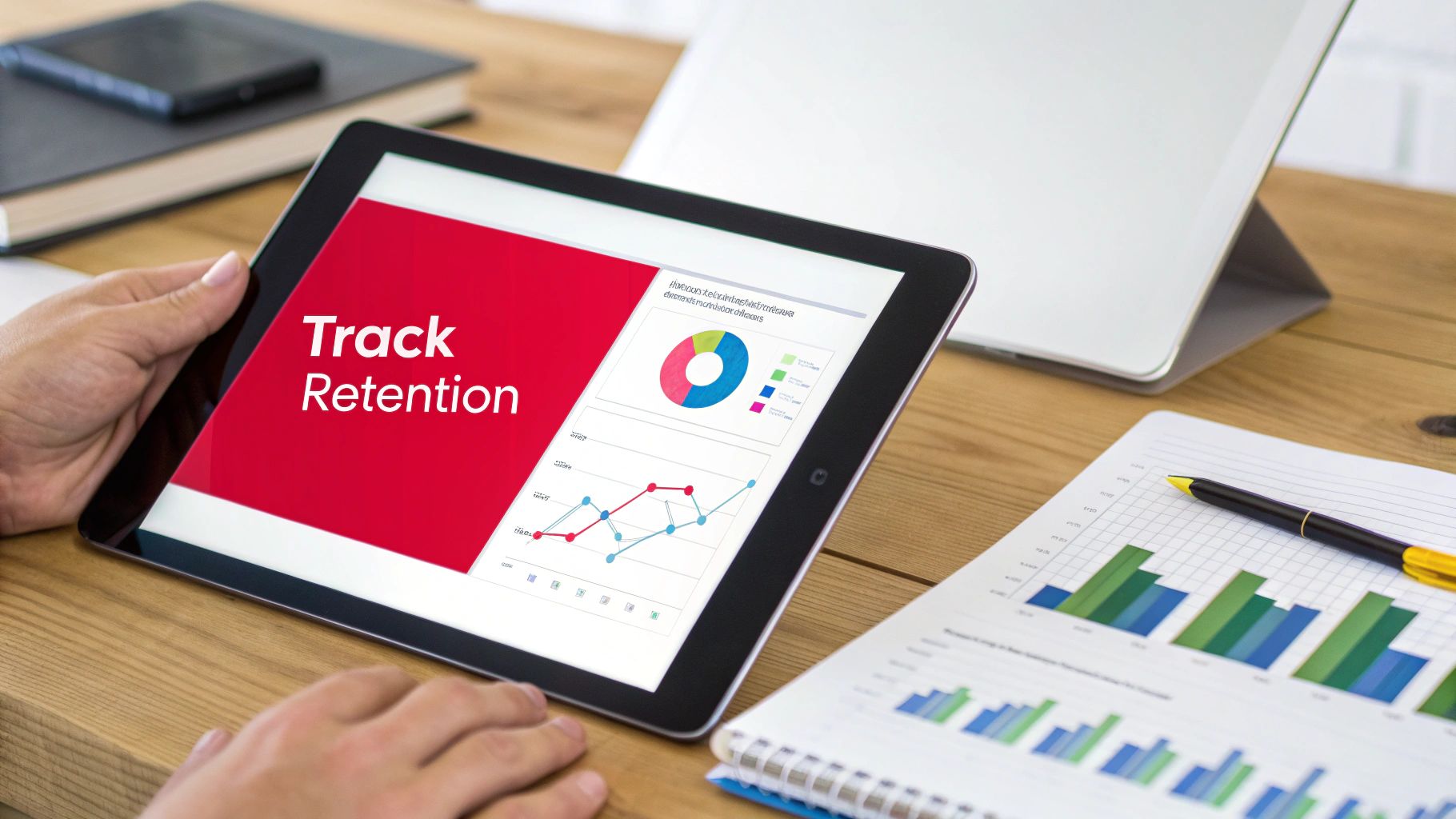
- Identify High-Engagement Moments: Use ViewsMax's analytics to pinpoint sections in your long-form videos with the highest audience retention and engagement spikes. These are proven moments that resonate with viewers.
- Clip and Reformat: Extract 3-5 of these key moments. Use editing software or YouTube Studio’s "Edit into a Short" feature to reformat them into a 9:16 vertical aspect ratio.
- Add Value: Enhance each clip with bold, easy-to-read captions, as most short-form content is viewed without sound. Consider adding a new hook or a concluding call-to-action that’s relevant to the short-form platform.
- Optimize and Schedule: Use ViewsMax to generate platform-specific titles, descriptions, and relevant hashtags (#shorts, #youtubeshorts). Schedule the clips to post over several days or weeks following the main video's launch to sustain momentum. For more specific tactics, you can learn how to get more views on YouTube Shorts and apply those principles here.
2. Video to Blog Article Transcription
This content repurposing strategy transforms your spoken video content into a powerful, text-based asset that can capture an entirely new audience through search engines. By transcribing your video and expanding it into a comprehensive blog article, you create a resource that is discoverable on Google, driving organic traffic back to your website and, in turn, your YouTube channel.

Why It Works
While YouTube is the world's second-largest search engine, Google remains the first. A blog post allows you to compete for long-tail keywords and capture users who prefer reading over watching. This method doubles your content's visibility, positioning you as an authority in your niche across different platforms. For instance, learning how to turn a webinar into a blog post can effectively convert your video content into valuable written assets. Channels like Wistia use this approach to turn video tutorials into resource articles that rank for key search terms.
Key Insight: Don’t just copy and paste your transcript. Enhance the article with 20-30% new information, including deeper explanations, additional examples, or related resources, to provide unique value that makes the blog post a standalone piece of content.
How to Implement This Strategy
- Transcribe Your Video: Use an automated service like Otter.ai or Rev for a quick transcription, or use the auto-generated transcript from YouTube. Manually clean up the text for accuracy, grammar, and readability.
- Structure and Expand: Organize the transcript into a logical blog post format with H2 and H3 headings. These headings should correspond to the main talking points or chapters from your video. Flesh out each section with more detail.
- Optimize for SEO: Use ViewsMax's keyword tools to identify relevant long-tail keywords for your article's title, headers, and meta description. This will help you rank higher in search results. Having a well-structured script from the start makes this process much easier; you can learn more about how to write a script for YouTube videos to streamline this workflow.
- Embed and Interlink: Embed the original YouTube video prominently within the blog post, usually near the top. Add timestamps throughout the article that link directly to specific moments in the video, creating a seamless experience for the reader.
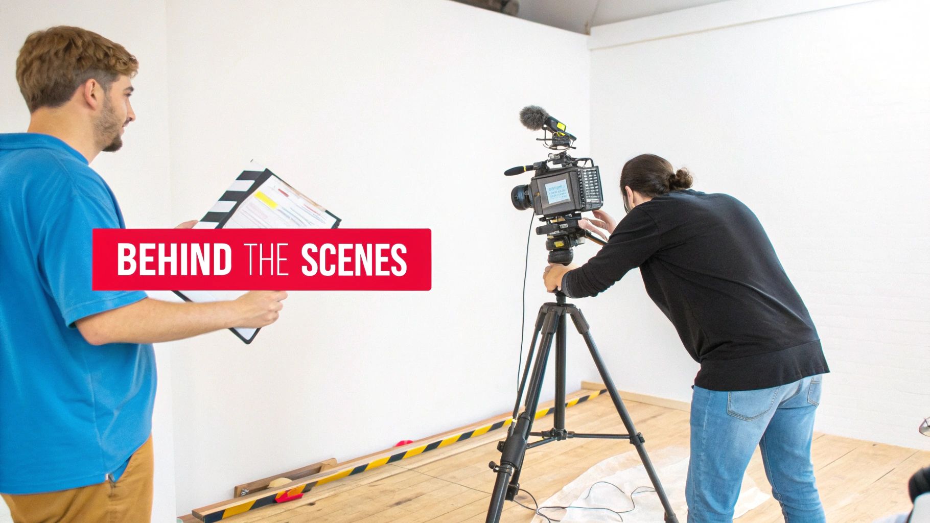
3. Compilation & Behind-the-Scenes Community Repurposing
This content repurposing strategy serves two powerful functions: bundling your best existing content into high-value compilations and building a deeper connection with your audience through authentic behind-the-scenes material. By creating thematic highlight reels, "best of" videos, or seasonal roundups, you give evergreen content a new lease on life. Simultaneously, sharing outtakes, bloopers, or production insights via Community posts and Shorts fosters a loyal following.
Why It Works
Compilation videos are incredibly effective because they deliver concentrated value, packaging your most impactful moments into one convenient, binge-worthy format. They appeal to both new viewers looking for a quick overview and existing fans who enjoy reliving highlights. Behind-the-scenes content works by humanizing your brand and making your audience feel like insiders. This exclusive access strengthens community bonds, which is a key driver for long-term channel growth.
Key Insight: Treat compilations as new, standalone pieces of content. Add unique intros, commentary, and updated graphics to provide fresh value rather than just stitching old clips together.
How to Implement This Strategy
- Identify Compilation Themes: Analyze your top-performing videos in ViewsMax to find common themes, popular topics, or recurring questions. Group 3-5 related videos to form a cohesive compilation like "My Top 5 Tips for…" or "Best Moments of 2024."
- Edit and Enhance: Assemble the clips and add a new introduction explaining the compilation's value. Use YouTube Chapters to allow viewers to navigate the video easily. Add new outros with a clear call-to-action.
- Capture BTS Content: Make it a habit to record short, raw clips on your phone during every shoot. Create a "footage bank" to pull from for Community posts, Shorts, and Reels. This content doesn't need to be polished; authenticity is the goal.
- Engage the Community: Use ViewsMax to schedule Community posts with behind-the-scenes photos, polls, and short video outtakes 3-5 times a week. This consistent engagement keeps your channel active between major uploads and can be a fantastic way to learn how to get more subscribers by turning casual viewers into dedicated fans.
4. Podcast and Audio Conversion Strategy
This strategy involves extracting the audio from your YouTube videos to create standalone podcast episodes. By distributing this audio content on platforms like Spotify, Apple Podcasts, and Google Podcasts, you tap into an entirely new audience that prefers to consume content while multitasking, commuting, or exercising. This expands your brand's reach beyond visual media and into the rapidly growing audio-first ecosystem.
Why It Works
Many viewers already listen to YouTube videos in the background, treating them like podcasts. This content repurposing strategy formalizes that behavior, offering a dedicated, user-friendly audio experience. It allows you to reach your audience in moments where watching a video isn't possible, such as during a drive or a workout. For content formats like interviews, lectures, or deep-dive discussions, the audio is often the most valuable component, making it a perfect fit for a podcast format without losing significant value.
Key Insight: Don't just rip the audio and upload. Add a podcast-specific intro and outro to welcome your audio listeners and guide them back to your YouTube channel for supplemental visual content or to join your community.
How to Implement This Strategy
- Select Audio-Friendly Videos: Identify videos where the visual component is not essential. Prime candidates include interviews, expert panels, storytelling videos, educational lectures, and commentary-style content.
- Extract and Polish the Audio: Use audio editing software to extract the audio track from your video file. Clean it up by removing visual-specific phrases (e.g., “as you can see on the screen”) and improving sound quality with equalization and compression.
- Package for Podcast Platforms: Create podcast-specific assets, including an introduction, an outro, and cover art. The intro should briefly introduce your channel and the episode's topic.
- Publish and Promote: Use a podcast hosting service to distribute your episode to major directories like Spotify and Apple Podcasts. In the podcast show notes, include timestamps and a direct link back to the original YouTube video for a complete, cross-platform experience. You can use ViewsMax to identify which video topics have the highest engagement, signaling they would perform well as audio episodes.
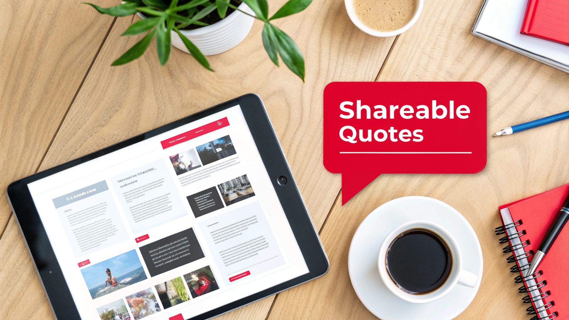
5. Social Media Quote and Carousel Post Creation
This strategy involves extracting the most potent quotes, statistics, and actionable insights from your video and transforming them into visually appealing graphics. By creating branded quote cards and multi-slide carousel posts for platforms like Instagram, LinkedIn, and Pinterest, you convert spoken words into highly shareable, static content that reinforces your message and drives traffic back to your YouTube channel.
Why It Works
Static graphics are incredibly versatile and easily consumed, making them perfect for platforms where users scroll quickly. A powerful quote or a compelling statistic can stop a user mid-scroll and deliver immediate value. Carousel posts take this further by creating a mini-narrative, encouraging users to swipe through a series of connected tips or steps. This form of content repurposing establishes you as a thought leader and gives your audience easily digestible, savable, and shareable assets that keep your brand top-of-mind.
Key Insight: Don't just paste text onto a background. Design templates that reflect your brand's visual identity. A well-designed graphic is not just a piece of information; it’s a brand ambassador that lives on through shares and saves.
How to Implement This Strategy
- Mine for Memorable Moments: Review your video transcript to identify 5-10 key takeaways. Look for motivational statements, surprising statistics, actionable tips, or controversial opinions that can stand alone and spark curiosity.
- Design Branded Templates: Use tools like Canva or Adobe Express to create a set of consistent, branded templates for quote cards and carousels. Ensure your YouTube channel handle or logo is subtly included on every graphic.
- Create and Contextualize: For carousels, break down a process or list from your video into a step-by-step format across multiple slides. In the post caption, provide context and a clear call-to-action, such as "Watch the full video for a deep dive on this topic! Link in bio."
- Optimize for Each Platform: Use ViewsMax to craft compelling captions that tie back to your video's core themes. Tailor your hashtags for each platform (e.g., use #LinkedIn for professional insights, #Instagram for visual appeal) to maximize the reach of these valuable content repurposing strategies. Schedule these graphics to post over several weeks to continuously promote the original video.
6. Email Newsletter and Lead Magnet Repurposing
This strategy transforms your video content into valuable assets designed to build and nurture an email list, one of your most important owned marketing channels. By converting your video’s core concepts into downloadable lead magnets like checklists, guides, or templates, you can offer tangible value in exchange for a viewer’s email address. This moves your audience from a rented platform like YouTube to a direct line of communication you control.
Why It Works
An email list is a powerful asset, immune to the whims of platform algorithms. This content repurposing strategy creates a direct path for your most engaged viewers to become loyal subscribers. Offering a high-value, downloadable resource that complements your video content incentivizes sign-ups and deepens the relationship. It's an excellent way for educators, coaches, and brands to generate leads, segment their audience by interest, and eventually promote products or services.
Key Insight: The most effective lead magnets solve a specific problem mentioned in your video. Instead of just summarizing the content, create a practical tool (like a checklist or workbook) that helps viewers implement what they just learned.
How to Implement This Strategy
- Identify Lead Magnet Opportunities: Review your top-performing videos. Look for content that teaches a process, offers a list of tips, or provides a framework. These are perfect candidates for a downloadable PDF checklist, guide, or workbook. For example, a video on "10 Tips for Better Thumbnails" could become a "Thumbnail Design Checklist" PDF.
- Create and Gate the Asset: Design a simple, branded PDF. Use a service like ConvertKit or Mailchimp to create a landing page where viewers can enter their email to receive the download automatically. Mention and link to this landing page in your video description, pinned comment, and end screen.
- Develop a Nurture Sequence: Set up an automated welcome email series for new subscribers. The first email should deliver the promised lead magnet. Subsequent emails can share links to related videos, offer exclusive tips, or introduce your paid products, adding further value and keeping your audience engaged.
- Optimize the Funnel: Use ViewsMax to identify which of your video topics generate the most interest, helping you decide which lead magnets to create next. Track your landing page conversion rates and email open rates to refine your value proposition and subject lines for maximum effectiveness.
7. Webinar and Live Stream Conversion
This powerful strategy involves transforming your existing on-demand video library into live, interactive events like webinars or converting past live streams into structured courses. By repurposing high-value video content for a live audience, you create premium, synchronous experiences that drive deeper engagement and open new monetization channels beyond standard ad revenue.
Why It Works
Webinars and live workshops create a sense of urgency and exclusivity that pre-recorded videos cannot replicate. This content repurposing strategy allows you to leverage your proven, evergreen content as a foundation for a high-touch, interactive event. It’s perfect for educators, coaches, and brands who want to build a stronger community, generate qualified leads, or sell premium products and services directly to an engaged audience. The live format justifies a higher price point and provides valuable, direct feedback from your most dedicated followers.
Key Insight: The value of a webinar isn't just the information, which may already exist on your channel, but the live access to you. Focus on interactive elements like Q&A sessions, live polls, and breakout discussions to make the experience unique and justify attendance.
How to Implement This Strategy
- Identify High-Demand Topics: Use ViewsMax analytics to find videos with high watch time, strong engagement, and recurring questions in the comments. These are prime candidates for a deeper, live exploration.
- Structure the Live Event: Outline a webinar flow that expands upon your original video. Create new slides, add updated examples, and prepare bonus materials like checklists or templates exclusively for attendees.
- Promote and Capture Leads: Create a dedicated registration page that clearly outlines the value of attending live versus just watching the YouTube video. Use your channel and other social platforms to drive sign-ups, treating your original video as a lead magnet for the event.
- Repurpose the Recording: After the live event, edit the recording to create new assets. You can offer it as a premium on-demand course, clip the best Q&A moments for YouTube Shorts, or post a condensed version back on your main channel to promote future webinars. This is one of the most effective content repurposing strategies for creating a self-sustaining content ecosystem.
8. Interactive Quiz and Assessment Content
This advanced strategy transforms your educational or advice-driven video content into an engaging, two-way experience. By converting key lessons or concepts from your videos into interactive quizzes or assessments, you create a powerful tool that not only educates your audience but also captures valuable insights and drives deeper engagement with your channel.
Why It Works
Interactive content shifts the viewer from a passive consumer to an active participant. Quizzes and assessments gamify the learning process, making it more memorable and enjoyable. This approach boosts viewer retention and reinforces your authority on a topic. It also provides a unique opportunity to gather audience data, helping you understand knowledge gaps and interests, which can directly inform your future content calendar. Finance, personal development, and skill-based channels excel with this method.
Key Insight: Design quizzes where incorrect answers link directly to the specific timestamp in your video that explains the concept. This closes the learning loop and drives viewers back to your content with a clear purpose.
How to Implement This Strategy
- Identify "Testable" Content: Review your top-performing educational videos. Pinpoint core concepts, key takeaways, or step-by-step processes that can be broken down into 5-10 clear questions.
- Build the Quiz: Use a third-party tool like Typeform, Google Forms, or a dedicated quiz builder to create your assessment. For each question, craft a clear prompt with multiple-choice answers based on your video's content.
- Integrate with Your Video: Promote the quiz within your YouTube video using interactive cards, end screens, or a prominent link in the description. You can embed it on your website and direct traffic there for a more controlled experience.
- Personalize the Results: Create a results page that doesn't just show a score. Offer personalized feedback and recommend specific follow-up videos from your channel based on the user's answers, creating a customized content journey. ViewsMax can help you identify related videos with high engagement to recommend.
9. Affiliate Marketing and Product Round-Up Content
This strategy transforms your existing product reviews, recommendations, and comparison videos into monetized written content. By creating affiliate-focused articles, detailed round-ups, and dedicated resource pages, you can generate a new revenue stream from the research and opinions you’ve already shared in your videos, capturing audiences who prefer to read and compare products before purchasing.
Why It Works
Many viewers watch product reviews as part of their buying journey and often search for written guides to compare features and prices. This content repurposing strategy meets them where they are, providing tangible value while earning you a commission. It establishes your authority beyond video and creates evergreen assets that can generate passive income long after a video is published. It’s a powerful way to monetize your expertise without creating new video content.
Key Insight: Don't just list products. Structure your round-ups to solve a specific problem or cater to a particular user type (e.g., "Best Vlogging Cameras Under $500," "Top Productivity Tools for Solo Creators"). This targeted approach drives higher-intent traffic and conversions.
How to Implement This Strategy
- Catalog Your Product-Related Videos: Identify all your videos that feature product reviews, recommendations, or tutorials. These are your source materials for creating affiliate content.
- Structure the Round-Up or Guide: Outline a blog post or resource page based on a high-intent keyword like "best," "review," or "comparison." Transcribe key points from your videos and organize them into a coherent, easy-to-read format. For example, a tech review channel can compile multiple camera reviews into a "Best Cameras for YouTube in 2024" guide.
- Integrate Affiliate Links and Disclosures: Sign up for affiliate programs for the products you recommend. Embed your unique affiliate links naturally within the text and add a clear, prominent disclosure statement at the beginning of the article to comply with FTC guidelines.
- Optimize for SEO and Promote: Use ViewsMax to identify high-performing keywords from your video titles and descriptions and incorporate them into your article's headings and body text. Promote the new resource page in the descriptions of your relevant YouTube videos and share it with your email list.
10. LinkedIn and B2B Professional Content Adaptation
This strategy involves adapting your YouTube content for a professional B2B audience on LinkedIn. By transforming video insights into polished articles, data-rich carousels, and detailed case studies, you can reposition your expertise to capture high-value professional opportunities, build authority in your niche, and engage with industry decision-makers directly on their preferred platform.
Why It Works
LinkedIn is a hub for professional development, industry networking, and B2B lead generation. Unlike entertainment-focused platforms, its users actively seek valuable, data-driven insights to solve business challenges. This content repurposing strategy allows you to meet this demand by presenting your video content in formats native to the platform, such as in-depth articles and digestible carousels. This establishes you as a thought leader, driving relevant traffic not just to your YouTube channel but also to your professional services or products.
Key Insight: Don't just share a link to your YouTube video. Natively publish the core concepts as a LinkedIn article or carousel, adapting the tone and depth to a professional audience that values actionable frameworks and tangible results over pure entertainment.
How to Implement This Strategy
- Identify B2B-Relevant Videos: Review your YouTube library for content covering business strategies, case studies, tutorials, or professional development topics. Videos with clear frameworks or step-by-step processes are ideal candidates.
- Choose the Right Format: For a deep dive, convert your video script into a 1,500-word LinkedIn article, enriching it with data, charts, and professional language. For a scannable, high-impact piece, turn a multi-point framework from your video into a PDF carousel document.
- Adapt and Enhance for Professionals: Rewrite the content with a more formal, authoritative tone. Focus on business outcomes, ROI, and actionable takeaways. Remove casual slang and add industry-specific terminology to demonstrate expertise.
- Optimize for LinkedIn's Algorithm: Publish your content during peak business hours (Tuesday-Thursday mornings). Tag relevant companies, influencers, and industry groups to expand your reach. End your post with a thought-provoking question to encourage comments and drive engagement.
10-Strategy Content Repurposing Comparison
| Repurposing Strategy | 🔄 Complexity | ⚡ Resources & Speed | ⭐ Expected Outcomes | 📊 Ideal Use Cases | 💡 Key Advantages / Tips |
|---|---|---|---|---|---|
| Long-Form to Short-Form Video Conversion | Medium — editorial selection + platform-specific edits | Low–Medium — simple cuts & templates; fast turnaround | ⭐⭐⭐ High reach & posting frequency; potential subs growth | Creators with 10–60 min high-engagement videos for Shorts/Reels/TikTok | 💡 Test 3–5 clips per video; preserve core branding; stagger releases |
| Video to Blog Article Transcription | Medium–High — transcription + SEO rewriting | Medium — editing and SEO time; slower than clips | ⭐⭐⭐ Evergreen organic traffic and SEO authority | Tutorials, deep-dive explainers, evergreen educational content | 💡 Add 20–30% new value; optimize headers & meta; embed video |
| Compilation & Behind-the-Scenes Repurposing | Medium — curation and narrative flow editing | Medium — leverages unused footage; moderate edit time | ⭐⭐⭐ Extended watch time and stronger audience loyalty | Gaming, podcasts, vlogs with ample outtakes/BTS | 💡 Use chapters/playlists; collect BTS during shoots; add unique intros |
| Podcast and Audio Conversion Strategy | Low–Medium — audio extraction + metadata creation | Low — quick if audio is clean; aggregator distribution simple | ⭐⭐⭐ Expands reach to audio-first audiences; new monetization | Interviews, commentary, lecture-style videos | 💡 Remove visual cues, add intros/outros, include show notes & CTAs |
| Social Media Quote & Carousel Post Creation | Low — design + selective copywriting | High — fast with templates (Canva, etc.) | ⭐⭐⭐ Shareable brand touchpoints; traffic drivers to channel | Thought leadership, motivational, business, educational creators | 💡 Extract 5–10 quotes per video; keep on-brand visuals; include CTA |
| Email Newsletter & Lead Magnet Repurposing | Medium — content structuring + funnel setup | Medium — requires email platform & automation | ⭐⭐⭐ High LTV and owned-audience growth; strong conversion paths | Course creators, coaches, businesses building funnels | 💡 Gate high-value assets, automate delivery, segment lists for relevance |
| Webinar & Live Stream Conversion | High — live tech, interactivity, registration funnels | Low–Medium — prep time and platform costs; intensive per event | ⭐⭐⭐ High engagement, lead generation, and premium monetization | High-demand training topics, product launches, coaching offers | 💡 Offer exclusives, add polls/Q&A, record sessions for on-demand reuse |
| Interactive Quiz & Assessment Content | High — design, platform integration, testing | Low after build — initial heavy lift, reusable assets | ⭐⭐⭐ Very strong engagement and first‑party data capture | Educational series, diagnostics, lead-generation content | 💡 Keep quizzes short (5–10 Q); link incorrect answers to video segments |
| Affiliate Marketing & Product Round-Up Content | Medium — content creation + link/tracking upkeep | Medium — ongoing updates and tracking required | ⭐⭐⭐ Passive revenue from purchase-intent traffic if executed well | Tech, beauty, gear reviews, productivity/tool recommendations | 💡 Disclose affiliates, use tracking UTMs, focus on high-intent keywords |
| LinkedIn & B2B Professional Content Adaptation | Medium — tone/style adaptation and case-study creation | Medium — rewrite + imagery for professional formats | ⭐⭐⭐ Builds thought leadership, B2B leads and partnership opportunities | Marketing, SaaS, consulting, leadership and HR-focused creators | 💡 Publish long-form articles & carousels, use data-driven insights, post weekdays |
From Content Creator to Content Strategist
The journey from a single, well-crafted YouTube video to a comprehensive, multi-platform content ecosystem is no longer a luxury reserved for large media companies; it's an essential strategy for sustainable growth. Throughout this guide, we've explored ten distinct and powerful content repurposing strategies, moving far beyond the simple act of re-uploading clips. You now have a blueprint to transform your core video assets into everything from engaging blog posts and SEO-rich transcripts to captivating social media carousels, insightful newsletters, and professional B2B articles.
The fundamental shift is one of mindset. Every video you produce is not a final destination. Instead, think of it as a central hub, a primary asset from which countless other pieces of valuable content can radiate, each tailored to a specific platform and audience segment. This approach shatters the relentless cycle of the content treadmill, where the pressure to constantly create something new from scratch leads to burnout.
Key Takeaways: From Theory to Actionable Workflow
Mastering content repurposing means you stop trading time directly for content volume and start investing it in scalable systems. The true value lies not in just doing more, but in making what you've already done work harder and smarter for you.
Here are the most critical takeaways to integrate into your workflow immediately:
- Value Maximization: The core principle is to extract every ounce of value from the time, energy, and resources you invest in producing your primary long-form videos. Don't let your hard work have a single, fleeting moment in the spotlight.
- Audience Expansion: Repurposing allows you to meet your audience where they are. The person who discovers you through a 60-second TikTok might never have watched your 20-minute YouTube deep dive, but now they have a pathway to your channel. Conversely, a professional who finds your article on LinkedIn can be introduced to your more dynamic video content.
- SEO and Discoverability: By converting video to text (blog posts, transcripts, show notes), you create a wealth of indexable content. This significantly boosts your chances of being discovered through search engines like Google, which remains a massive traffic source for many creators.
- Reinforced Authority: Consistently appearing across multiple platforms with high-quality, relevant content solidifies your authority. You are no longer just a "YouTuber"; you become a recognized expert in your niche, building trust and credibility that transcends a single channel.
Your Next Steps: Building a Repurposing Engine
Feeling overwhelmed by the possibilities is normal. The key is to start small and build momentum. Don't try to implement all ten strategies at once. Instead, take a methodical approach.
- Conduct a Content Audit: Use your YouTube Analytics to identify your top-performing videos from the last 6-12 months. Which ones had the highest watch time, engagement, or generated the most subscribers? These are your prime candidates for repurposing.
- Select Two Strategies: Choose just two strategies from this list that feel most natural for your content and where you believe your audience spends their time. For a gaming channel, this might be Long-Form to Short-Form Video and Compilation & Behind-the-Scenes. For a business coach, it might be Video to Blog Article and LinkedIn Content Adaptation.
- Establish a Simple Workflow: Document the steps. For example: "For every new video published on Tuesday, I will create three short-form clips by Friday and schedule one blog post for the following Monday." Use tools to streamline this process wherever possible.
- Measure and Iterate: Track the performance of your repurposed content. Are your audiograms driving podcast listens? Are your blog posts ranking for new keywords? Use this data to refine your approach, doubling down on what works and adjusting what doesn't.
By embracing these content repurposing strategies, you make a deliberate transition. You move from being a creator who is constantly chasing the next video idea to a savvy content strategist who is building a resilient, interconnected brand. This is how you create a lasting digital footprint that grows, engages, and converts long after you hit "publish."
Ready to streamline your entire content lifecycle, from ideation to repurposing? ViewsMax is designed to help you manage your YouTube workflow, optimize your metadata for maximum reach, and identify the best videos to use for your content repurposing strategies. Start making smarter content decisions and build your content engine by exploring the tools at ViewsMax today.